
Category: design fails
141 Designs That Are So Bad, They Deserve To Be Shamed On The Internet (New Pics)
April 24, 2023
Most of us can intuitively tell whether something is designed well or if the end result falls way short of what it should be like. The more we’re exposed to ads and products—both great and god-awful—the more our sense of taste develops.
Ever since 2011, this popular subreddit has been sharing examples of epic design fails that are beyond hilarious. In fact, they’re so bad, it’s mind-boggling that the people behind them green-lit them! We’ve collected some of the worst offenders to share with you, Pandas, so scroll down and upvote the designs you love to hate the most.
More info: Reddit | Wiki
#1 Being Gay Was A Sin They Said
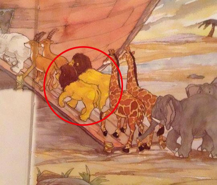
Image credits: TKZoroSantoryu
#2 This Amazing Pregnancy Test
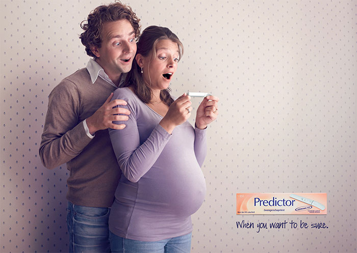
Image credits: Explodinator580
#3 So, It’s Fine Then?
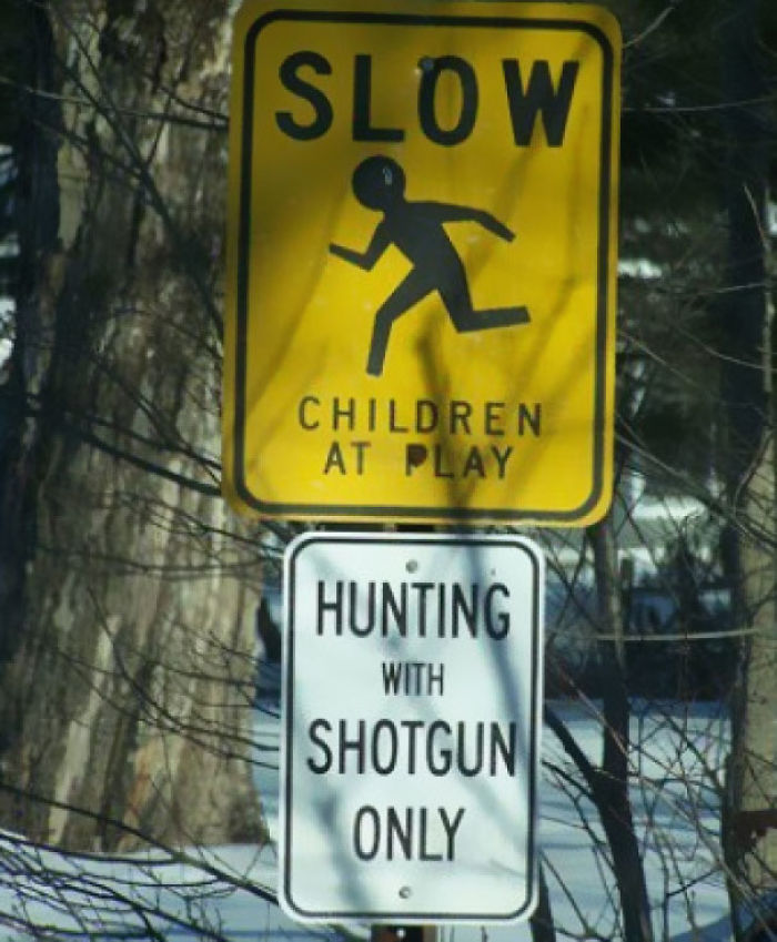
Image credits: juanjoli
The subreddit has been poking fun at horrible and hilarious designs all the way since 2011. Over the past 12+ years, the community has grown absolutely massive. At the time of writing, the group had 3.4 million members.
Years pass, seasons change. But what stays constant is people’s appetite for shaming truly awful product and ad designs. (What changes, however, is how the internet reacts to names like the subreddit’s that use gentle curse words. These days, you can’t even mention them in full without some social media megacorps frowning in your general direction!)
#4 Seems A Bit Counterintuitive
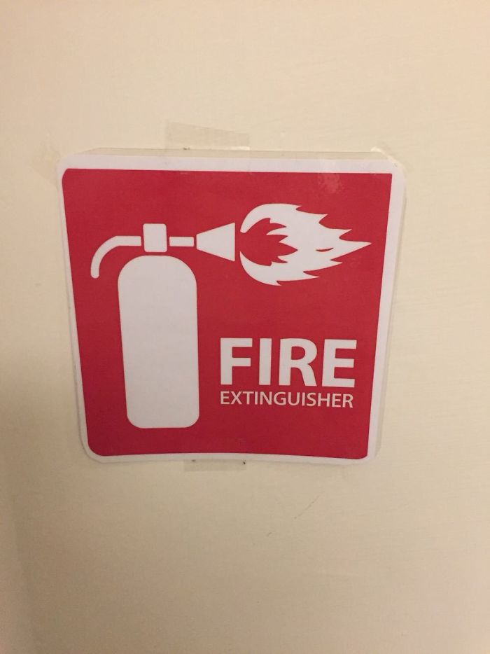
Image credits: cevanc
#5 A Solar Powered Parking Meter In An Underground Garage
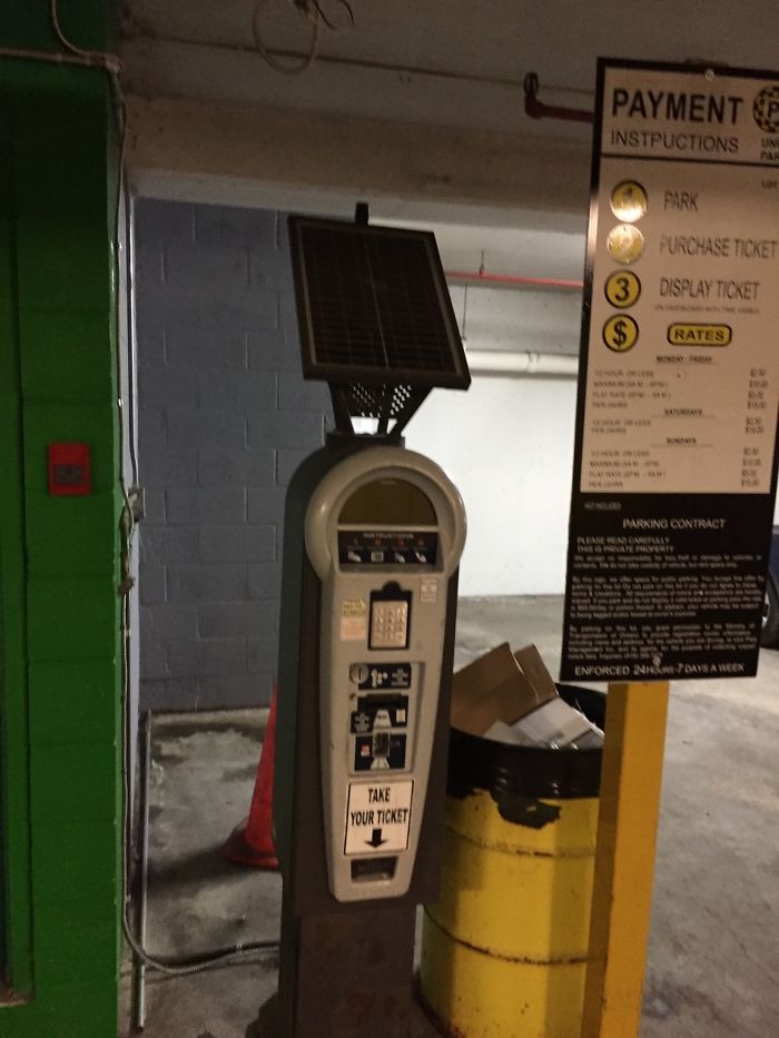
Image credits: Kadnify
#6 Surely There Is No Better Way To Write Your Phone Number
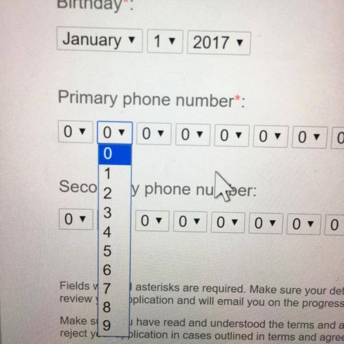
Image credits: aiden66
The subreddit’s moderators have created a fantastically detailed wiki that explains what does and doesn’t count as a bad design. For instance, amateur artwork or signs don’t belong in the online group because they were made by, well, amateurs. Similarly, broken things also don’t count.
#7 My Arms Are About 7 Feet Long, So This Wasn’t An Issue For Me
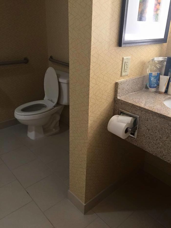
Image credits: Tekki
#8 Love Handles
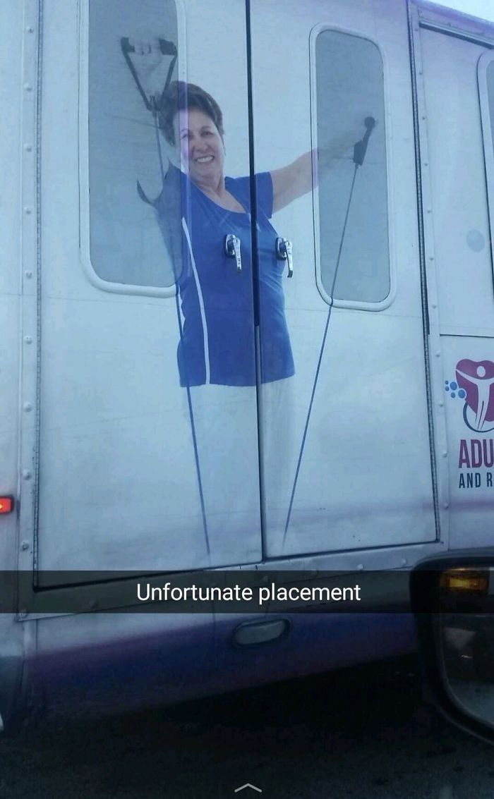
Image credits: dwThread
#9 I Cancelled My Transaction Twice In A Row By Accident. I Finally Found Out Why
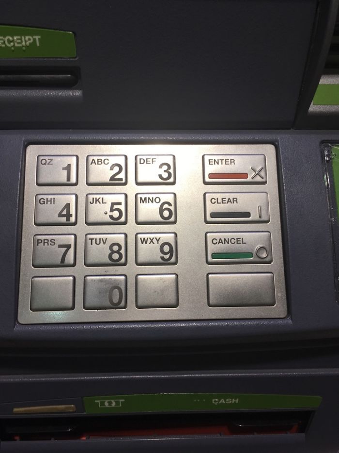
Image credits: KearBear
And don’t even think of posting the Roman numeral for 4, IIII, as an example of awful design because it’s a fairly common alternative way to write IV. Meanwhile, unintentional errors like manufacturing defects also don’t count as examples of bad design. Neither do novelty items or obvious satire.
#10 What About When You Cross Your Legs?
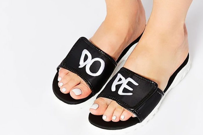
Image credits: UglyDuce
#11 Our Wedding Is Going To Have Three Delicious Meal Choices
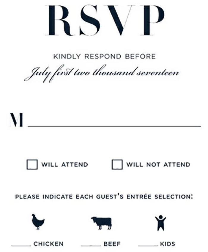
Image credits: Siggy778
#12 Thanks For Reminding Me
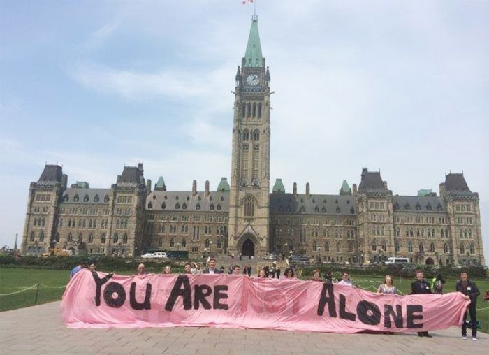
Image credits: Conicius
The mod team encourages its members to be original. So you shouldn’t be sharing any pictures that fall into the list of the top 150 most popular reposts. Software designs, hate symbols, and memes also don’t have any place on the sub. Meanwhile, all members ought to be as civil as possible, avoid sharing any personal information, and ensure that they write awesome descriptive titles for their posts.
#13 How Much Do You Trust Your “Multilingual” Ad Designer?
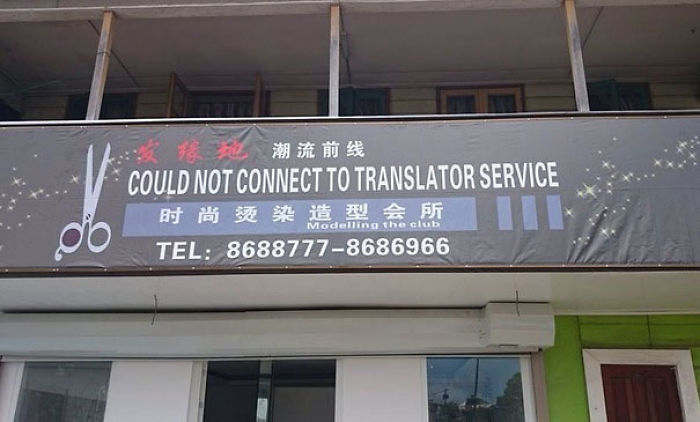
Image credits: badon_
#14 “How Do We Make It Clear That It’s A Male Hand Without Seeing The Nails?”
Image credits: neverindoubt
#15 This Bus
Image credits: reddit
A while ago, interior design expert and then-editor at These Three Rooms, Ariane Sherine, had shared her thoughts on taste and aesthetics with Bored Panda.
“When it comes to aesthetics, ‘bad design’ is a very individual thing that comes down to personal taste,” she said that our personal tastes and (dis)likes affect our judgment of products and interiors.
#16 This Music Poster Looks Like A Guy And Girl Being Hanged
Image credits: Mayafoe
#17 This Unfortunately Designed Kid’s Balloon
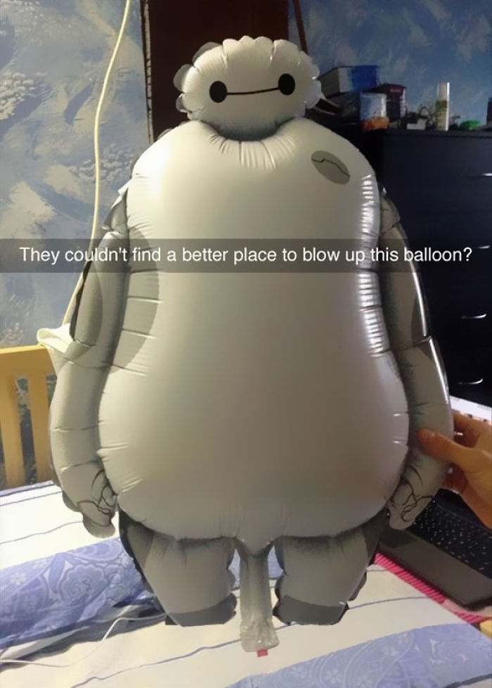
Image credits: ViolentThespian
#18 If Only There Was An Easier Way To See Who Was Outside Your Front Door..
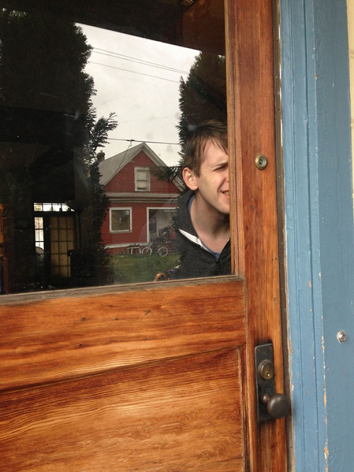
Image credits: The_Magi_Carpy
“It’s perhaps more helpful to talk about ‘bad design’ as design that doesn’t function as it should—for instance, a kitchen that doesn’t have what’s called ‘good flow’, where you have to walk impractical distances between complementary appliances and where the dimensions of the ‘kitchen work triangle’ (the distance between fridge, sink, and hob) aren’t practical,” the design expert said.
#19 Another Example Of Unrealistic Body Expectations For Men
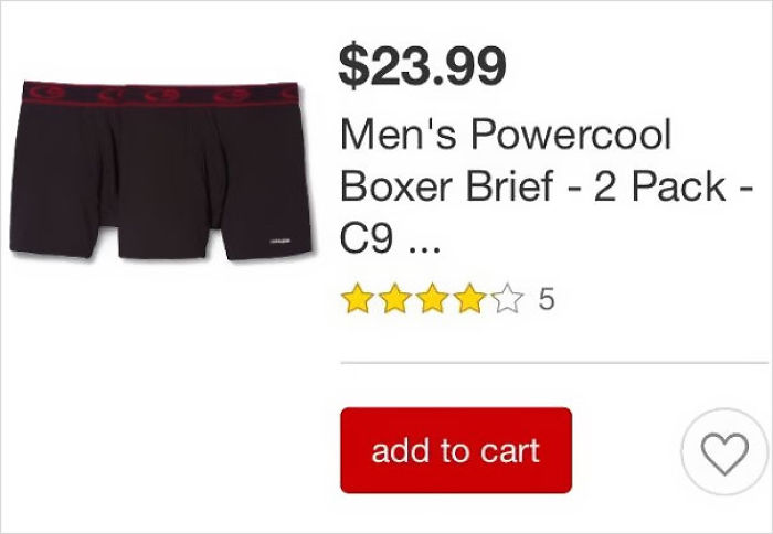
Image credits: deepshitgoeshere
#20 Le Tits Now
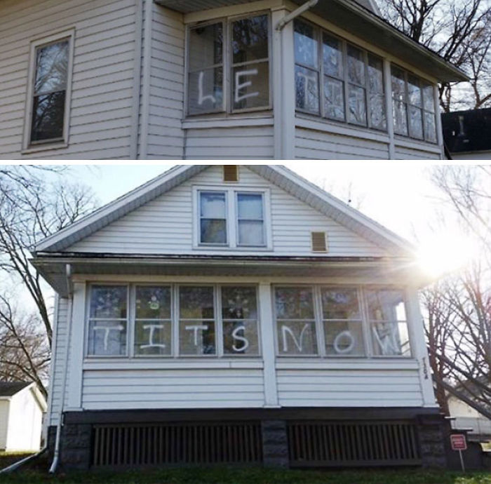
Image credits: Thee_Nick
#21 I Needed Red. Guess Which One I Grabbed At First
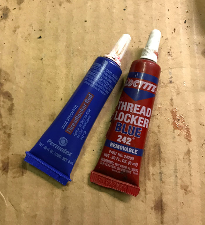
Image credits: bennythomson
“A kitchen where there isn’t enough storage, where potentially dangerous appliances aren’t located safely, and where cornflakes and milk are placed at opposite ends of the room is what I’d call ‘bad design,’” she shared that a poorly-crafted space can be a huge headache for someone in their day-to-day lives.
“‘Good design’ is where a lot of thought and effort has been put into structuring and renovating a house so it’s perfect for the people living in it. It takes account of their aesthetic preferences but also focuses on the concepts I mentioned before, paying close attention to detail,” she told Bored Panda.
#22 No Thank You, I Think I’ll Pass
Image credits: DragonsTurnMeOn
#23 Artistic Kid Dies
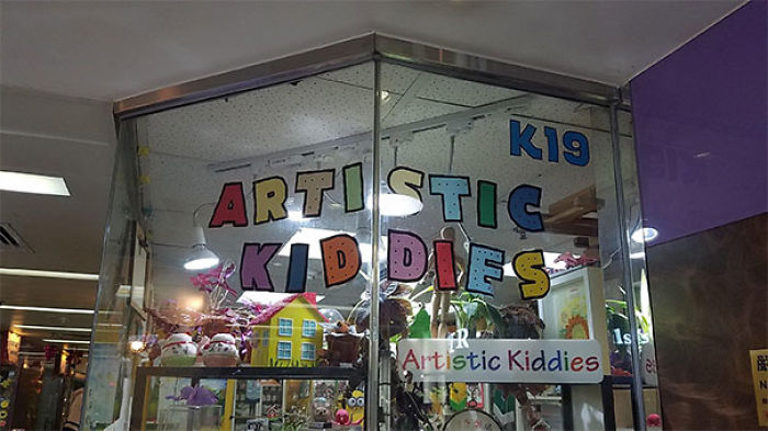
Image credits: Rosrit
#24 Okay. I Know This Cake Is A Number 1 And It Says “emma,” But It Looks Like A Dick With Balls That Says “weed”

Image credits: lama579
“The only true way to ascertain whether a design is going to be a commercial success is to make it available for sale, market it widely, and see how many people buy it. But success is different to taste. Personally, I think taste is all about understatement, minimalism, and neutral decor. But again, that’s only my personal opinion!” the design expert told us during another interview, earlier.
“This will differ for each person, but for many people, loud and garish colors used liberally in the home would signify a lack of taste. Then again, I can think of designers who have based their entire career around the use of color and loud prints,” she said that there aren’t any hard and fast rules.
#25 If Only I Had Some Scissors…
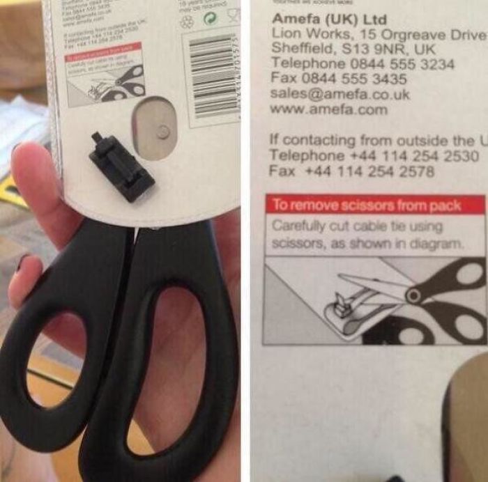
Image credits: BeardedMan32
#26 This Maze Game
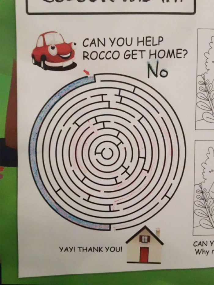
Image credits: peggiep9pm
#27 Meme Says It All…

Image credits: TheBensonBoy
When it comes to furniture, you have to consider functionality, not just aesthetics. “Does the furniture function as it should? Is it likely to collapse or break easily? If seating, is it comfortable? I mean, my idea of aesthetic hell would be a bright purple inflatable sofa with lime green spots, but your mileage may vary! The question of comfort and function is a less subjective one,” the design expert shared a few of the considerations you should keep in mind when thinking about interiors.
#28 If You’ve Got It, Flaunt It
Image credits: Momochichi
#29 What’s My Age Again?
Image credits: jcampbell514
#30 When Your Dental Banner Features An Execution
Image credits: admiralnorman
Tell us all about which of these pics and fails made you cringe the hardest, Pandas. Meanwhile, for some more amazingly awful designs, check out Bored Panda’s previous features right here, here, as well as here.
#31 F**king Hurry!!
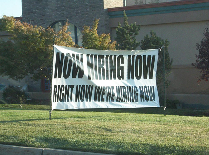
Image credits: NahAnyway
#32 This Could Have Been Avoided With 1 Focus Group (of Women)
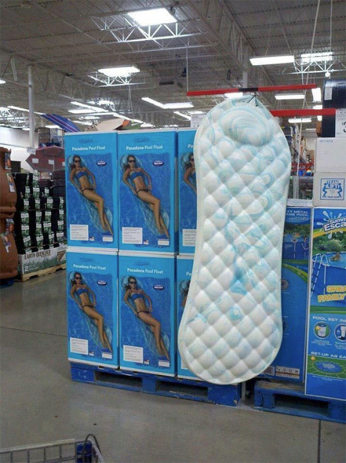
Image credits: JillianDavid13
#33 This Jfk Memorial

Image credits: -Tilde
#34 No Way Anyones Getting Past That
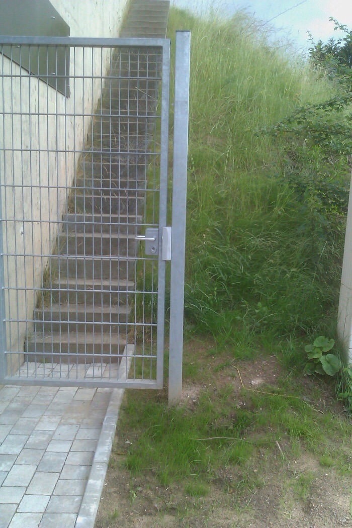
Image credits: TeLizardWizard
#35 Attention
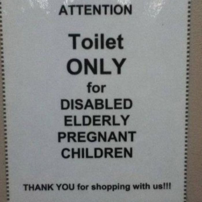
Image credits: boobooob
#36 Two Flamingos, One Vagina
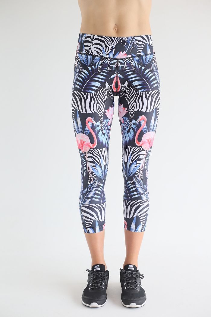
Image credits: afaintsmellofcurry
#37 Good Luck Wheelchairees
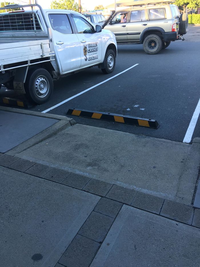
Image credits: OfficialDampSquid
#38 I Was Looking For Those…
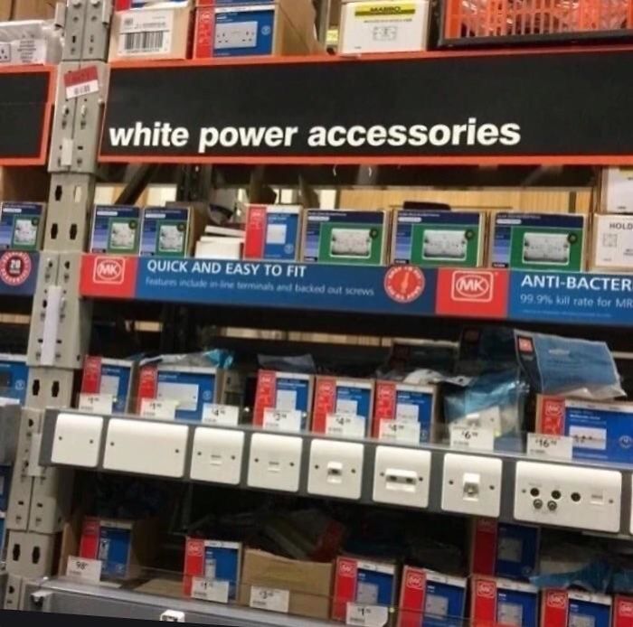
Image credits: Carter4502
#39 Sometimes It’s Okay To Judge A Book By Its Cover
Image credits: jaapgrolleman
#40 Love, Morriage, Boby?
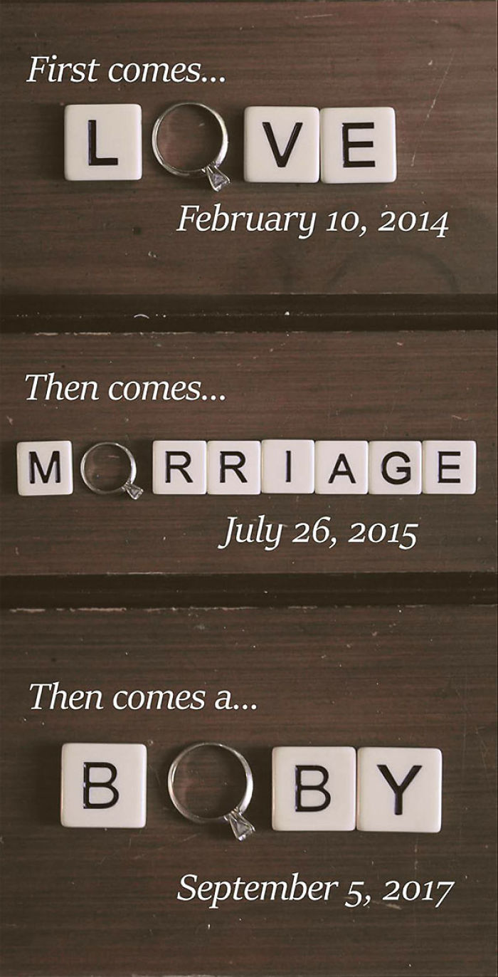
Image credits: redsox1524
#41 Never Split Your Legs When You Slide Down!
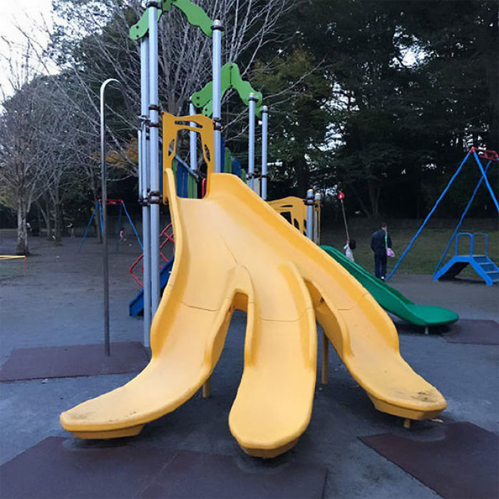
Image credits: AdmitOneOnly
#42 This Flower Print Dress

Image credits: 666
#43 If You Were In A Car, Would You Know What Accident To Do?
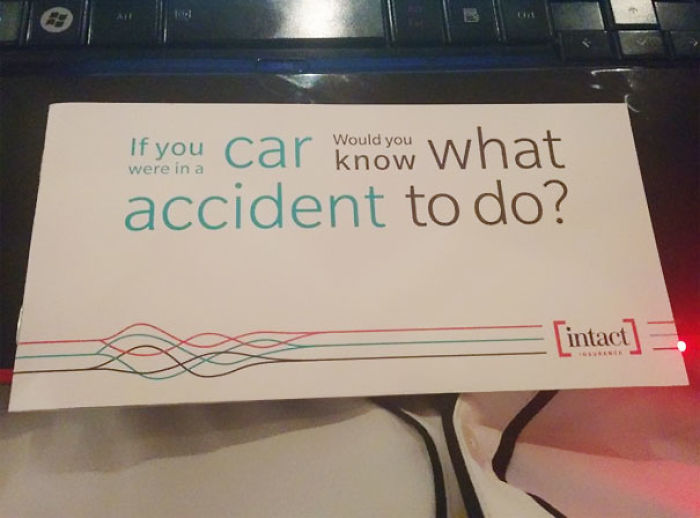
Image credits: JoJoeyJoJo
#44 Toilets And Mirror Ceiling
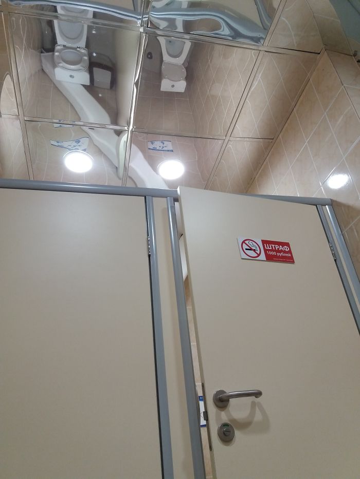
Image credits: zorton213
#45 This Warning Sign
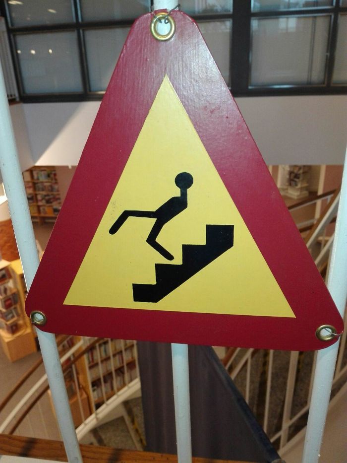
Image credits: awesomefacepalm
#46 All Ye Shall Come To Me For The Healing Of Burgers
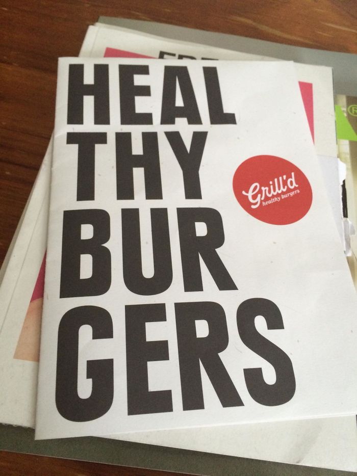
Image credits: deadpoolyes
#47 This Awful Slide Placement
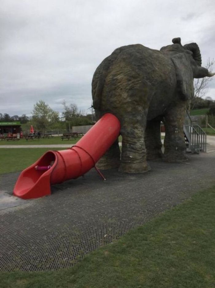
Image credits: unknown456
#48 Which Is It?!
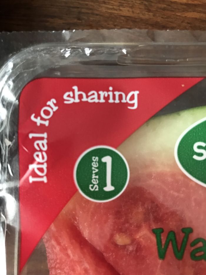
Image credits: Dcooper123
#49 I Have No Idea What I’m Doing

Image credits: billow2112
#50 Ass To Ass
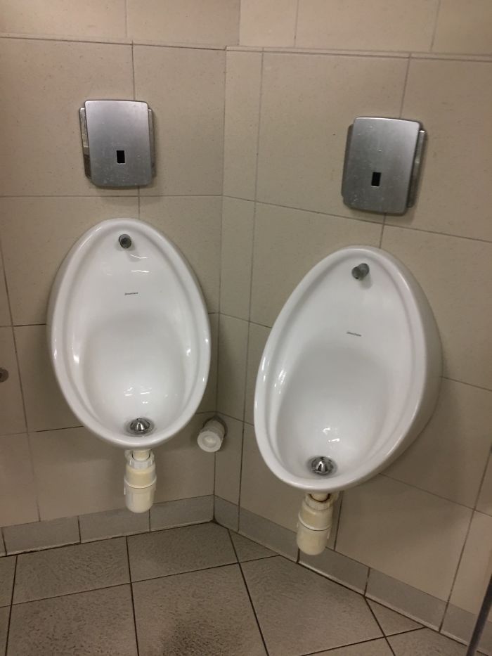
Image credits: Starhounder
#51 In Japan, You Have To Follow These Signs While Driving At 70 Mph
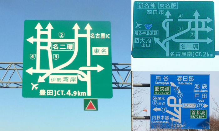
Image credits: tori_bird
#52 This University Isn’t Very Good With Fractions
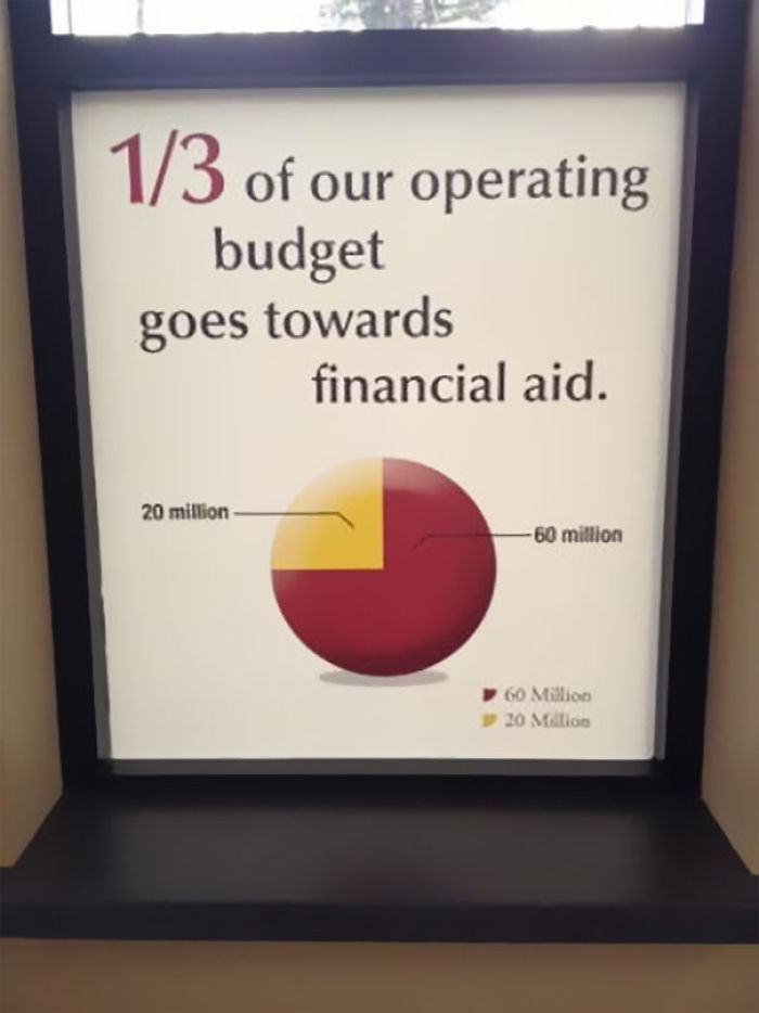
Image credits: Housson
#53 What A Great Packaging Choice
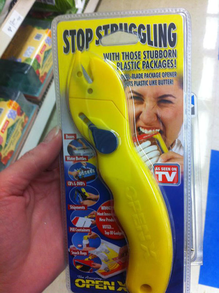
Image credits: bwaredapenguin
#54 50 Lanes? Lets Merge Those Into 4
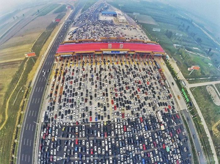
Image credits: JackleBee
#55 The Grill Being Sold On Amazon Is Only Supposed To Be A Foot Tall, But Can We Talk About The Gondola Silhouette?

Image credits: IceCreamTacosPizza
#56 Baby Jesus/severed Thumb Christmas Ornament
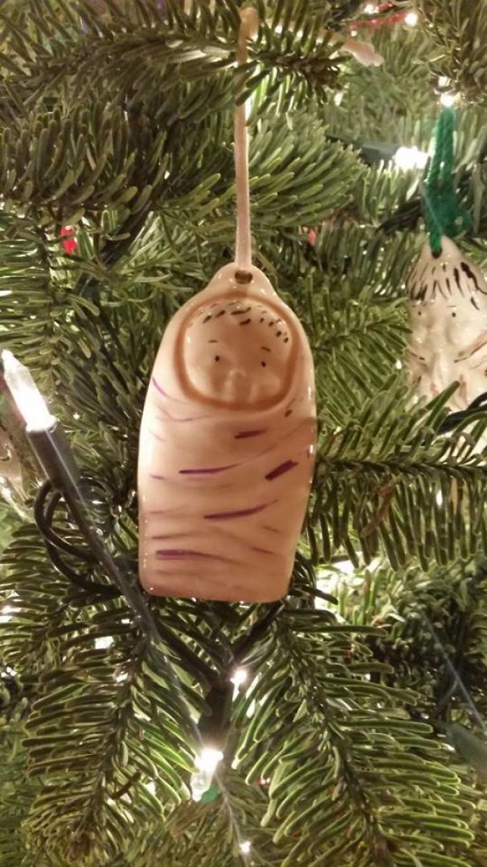
Image credits: Blenderhead36
#57 Correct Punctuation Is A Must!

Image credits: hmm-cheese
#58 Why Not Use The Selfie?
Image credits: Eddiecreates
#59 This Handicap Parking Spot…
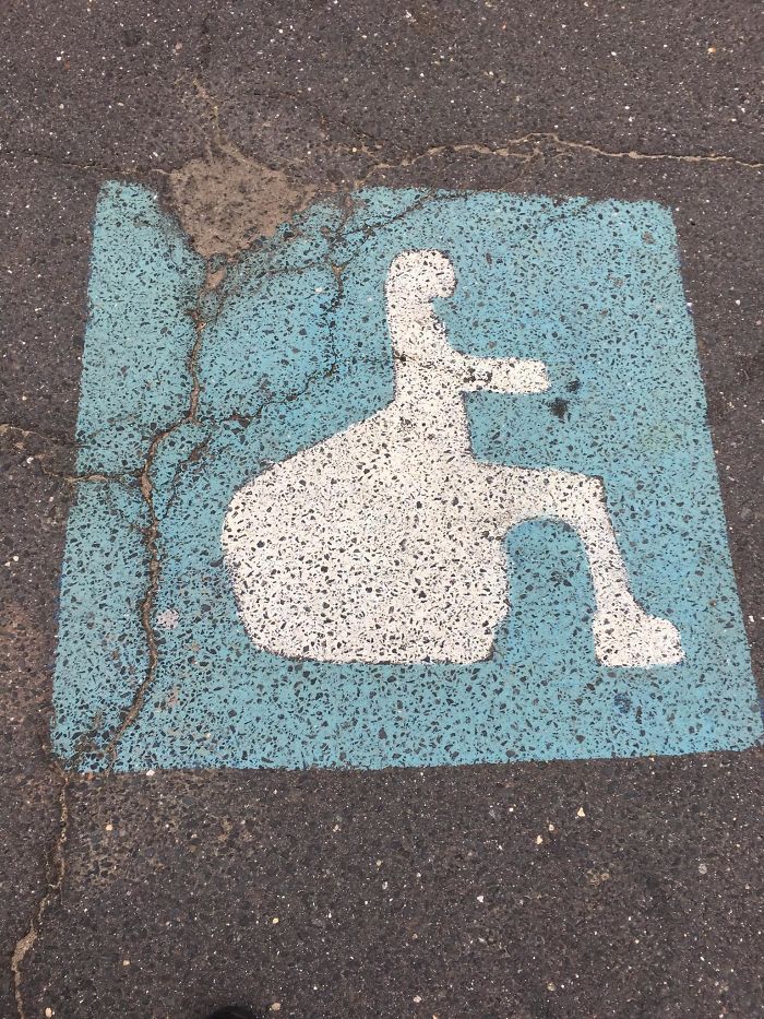
Image credits: holddemaio
#60 Sparkling Red “slippers”
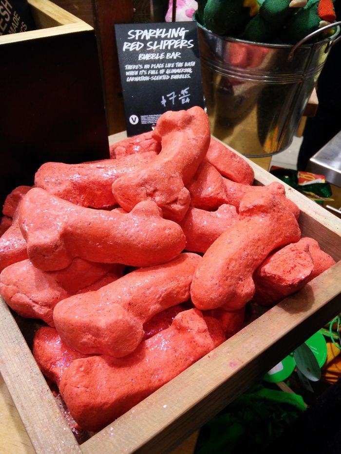
Image credits: throwd_away8675309
#61 Cool… What?!
Image credits: ledjimmypage
#62 Teaching Kids The Harsh Reality Of Life
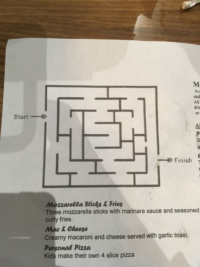
Image credits: MyBoener
#63 The Printing On This Ball
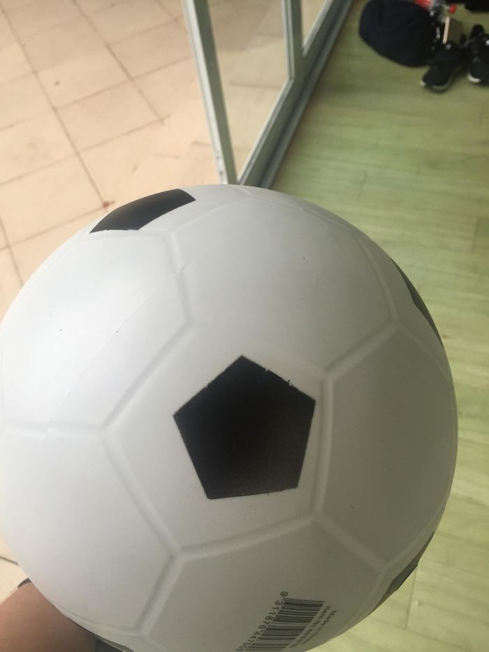
Image credits: lvchy
#64 The Tans Will Fade…
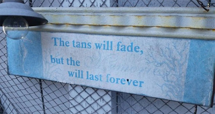
Image credits: Roguecop
#65 Do You Squirt?
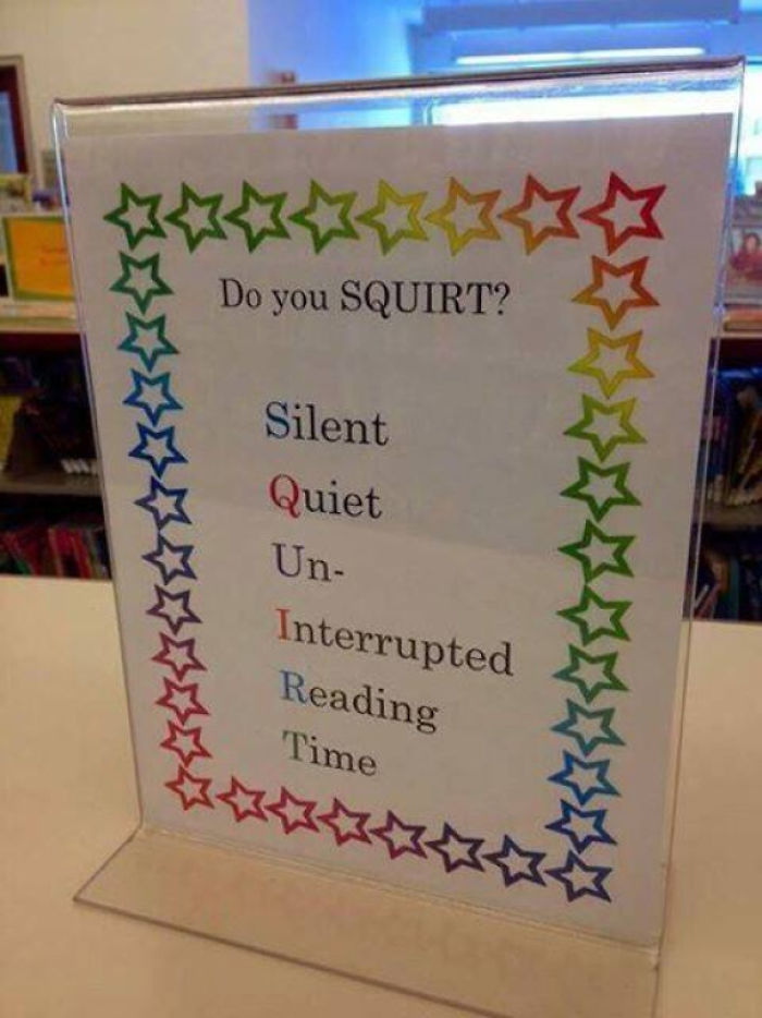
Image credits: justinwzig
#66 Toss Me A Cold One, Will Ya?
Image credits: freakame
#67 I’m Pretty Sure The Odds Are In My Favor To Win The Fight
Image credits: VirtualKorean
#68 The Vent In My Hotel Shower Doesn’t Seem To Work
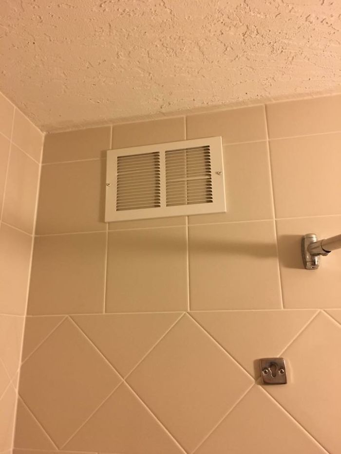
Image credits: eddygoombah
#69 Are The All The Translations Really Necessary Heinz?
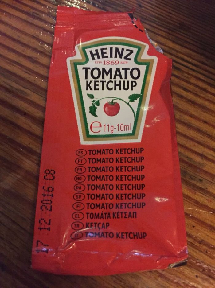
Image credits: bog_warrior_ie
#70 Measurement Lines On An Opaque Bottle
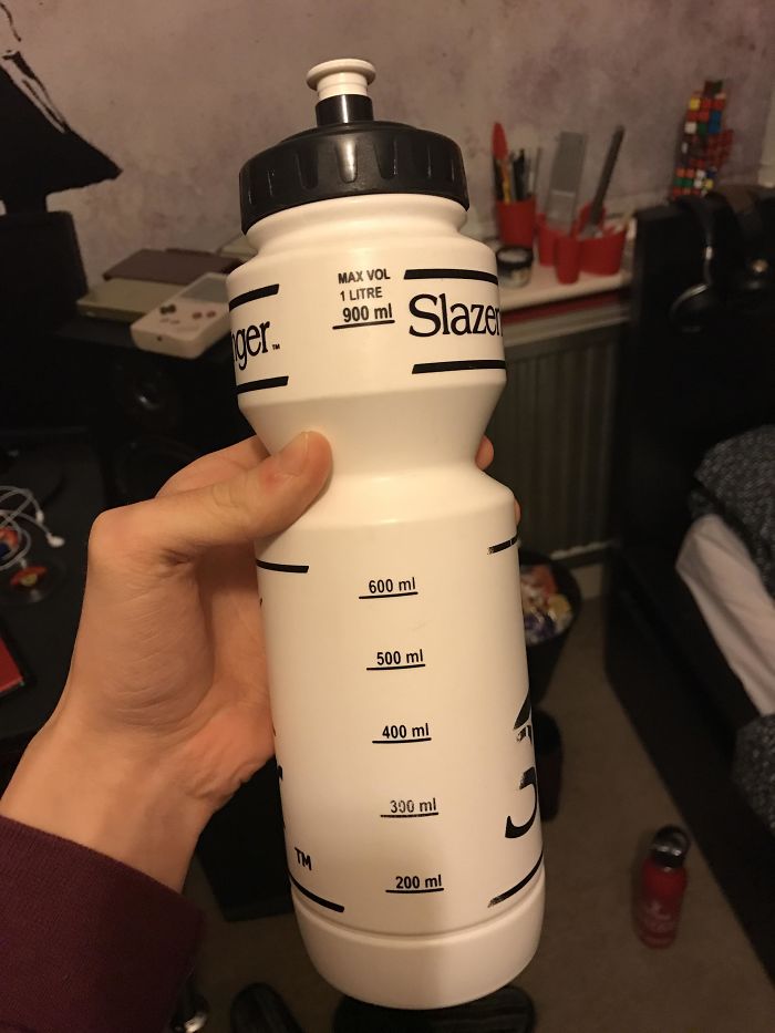
Image credits: sashley520
#71 Why The Hell Do The Weights Make Up The First H But Not The Last One?
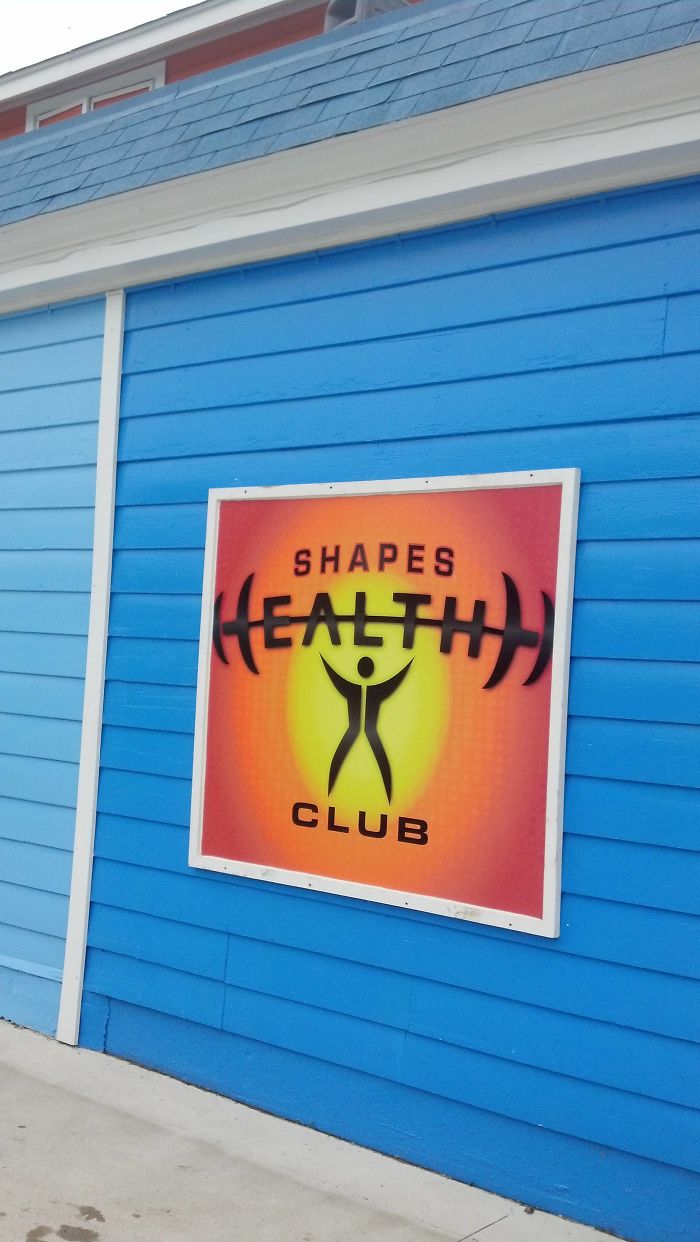
Image credits: WoodPeckker
#72 Why Is It Not The A ??
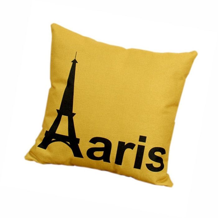
Image credits: psycoffman
#73 Kitten Socks
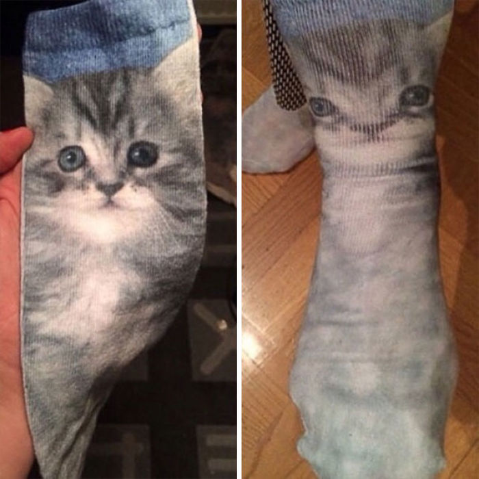
Image credits: KevlarYarmulke
#74 Giant Is Seconds From Being Paralyzed

Image credits: BIRDoS
#75 F**k Or Treat
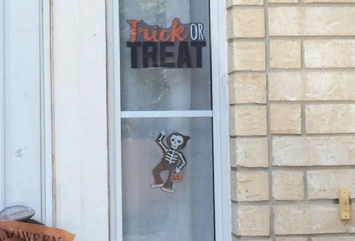
Image credits: KanataCitizen
#76 But They Are Both Right Hands
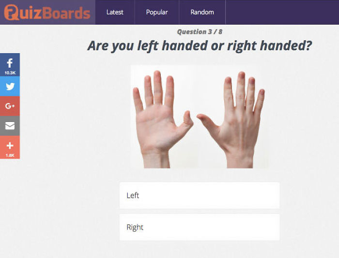
Image credits: flea123-rhcp
#77 “12 Wa S Y U Can Tell You Ha E Th Right”
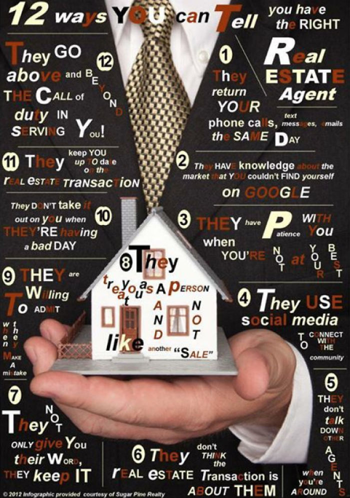
Image credits: justinerwin
#78 We’re Sorry…
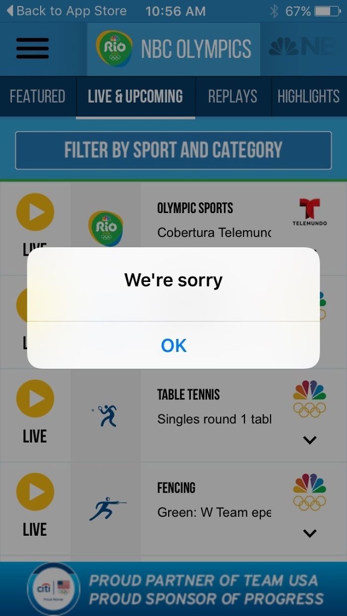
Image credits: 2ndmostimproved
#79 Not A Car, Not The Police…
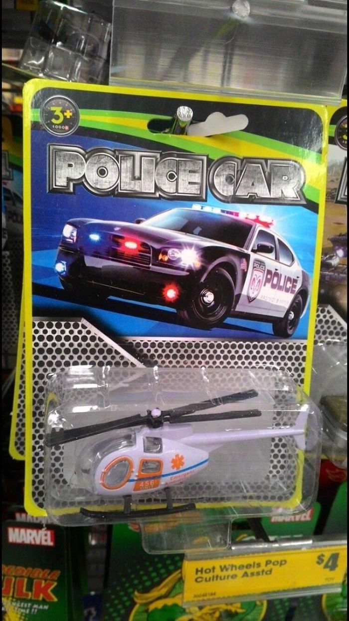
Image credits: LuffyTheAstronaut
#80 This Monstrosity Will Surely Make Someone Want To Date These Handsome Men

Image credits: lokiinthesky
#81 Poor Url Choice By A Fagas Strap Company
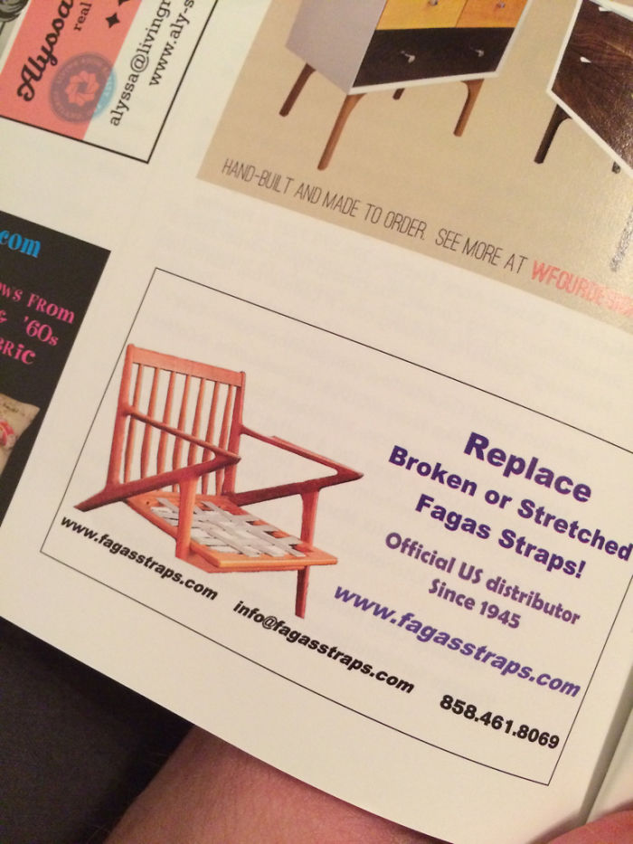
Image credits: omicron7e
#82 How Big Is That Watch?!
Image credits: skepticalDragon
#83 I Want To To Open A Shop In Goa That Slightly Copies A Popular Chain, What Should I Call It?
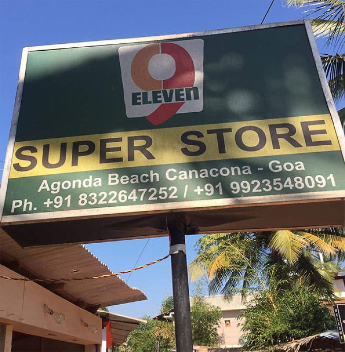
Image credits: Munt_Custard
#84 We’re Not Happy ’til You’re Not Happy
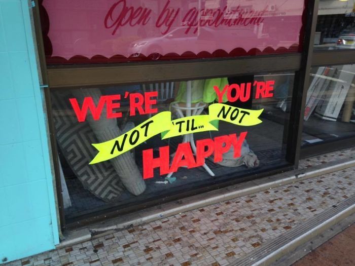
Image credits: Hantook
#85 Proof Your Layouts, People
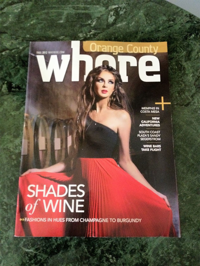
Image credits: Estoye
#86 Hot Dog Anyone?
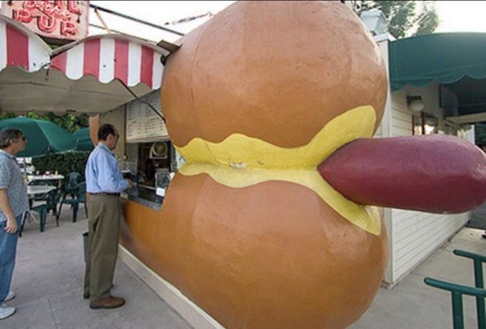
Image credits: AsianMasterium
#87 No Use! Only Charge!
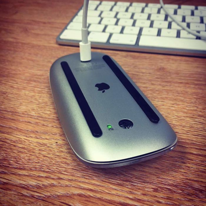
Image credits: RiggzBoson
#88 The Scaling Is So Bad…
Image credits: Smiteside
#89 Fake Zipper On Levi’s Boots Makes Holes In Your Boot When You Walk
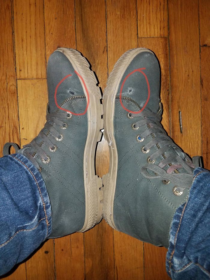
Image credits: peppaz
#90 Seriously?
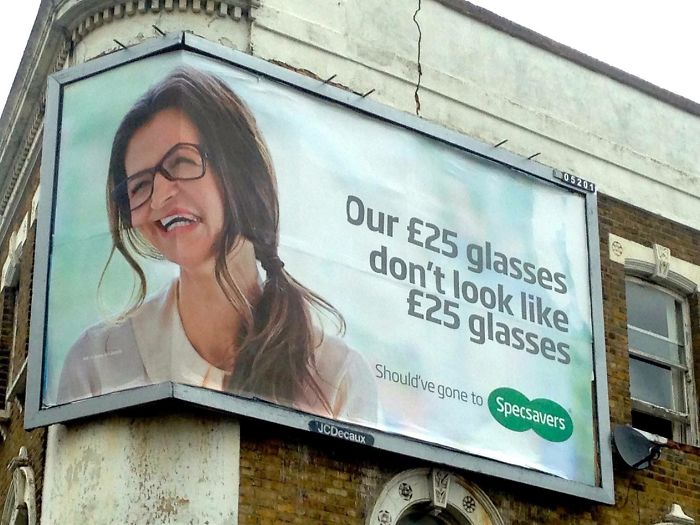
Image credits: GallowBoob
#91 Better Than Cream Cheese? No!
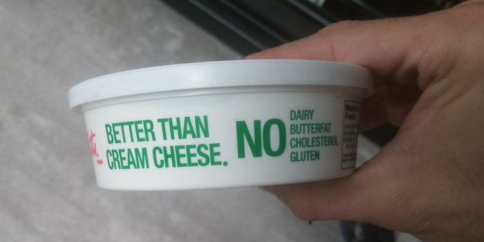
Image credits: ibegross
#92 …the “O” Has Already Been Guessed
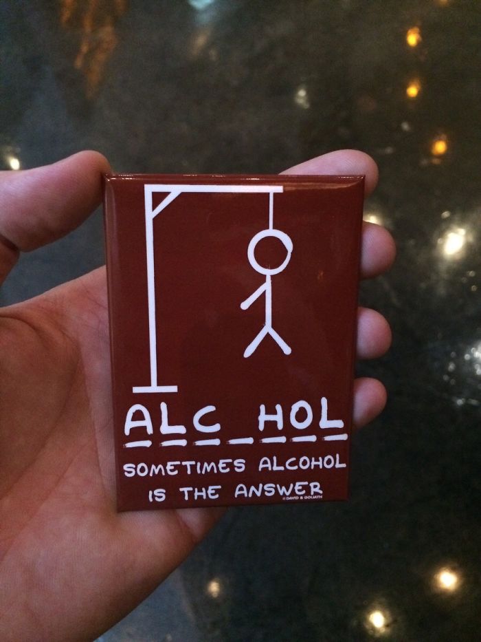
Image credits: crabbyshellfish
#93 Doesn’t Sound Very Exciting
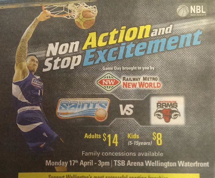
Image credits: thenewkelly
#94 From Afar, This Sign Has A Completely Different Meaning
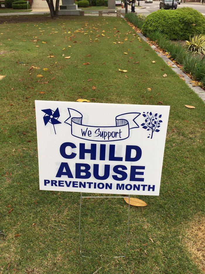
Image credits: tannerclary3
#95 Happy 20170!
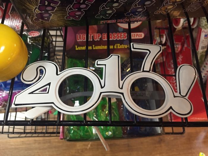
Image credits: bakugandrago18
#96 This Fucking Outlet At My University
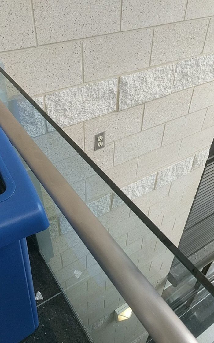
Image credits: txglasgow
#97 One Of The Worst Flow Charts I’ve Seen In A While
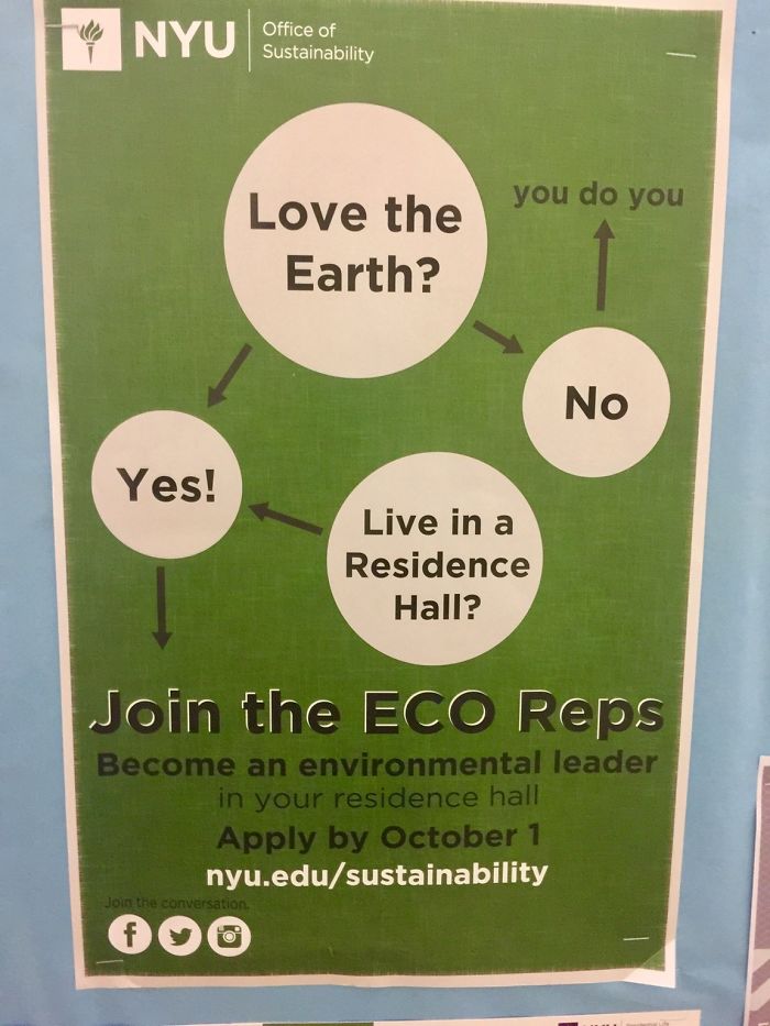
Image credits: Irate_Rater
#98 Suicidal Holiday Introvert, Look No Further
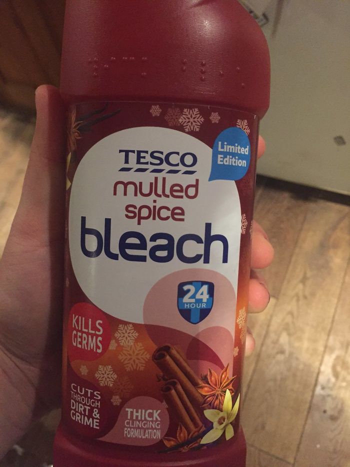
Image credits: George_E_Hale
#99 The Three Multiple Choice Options My Physics Teacher Gave For This Example Problem
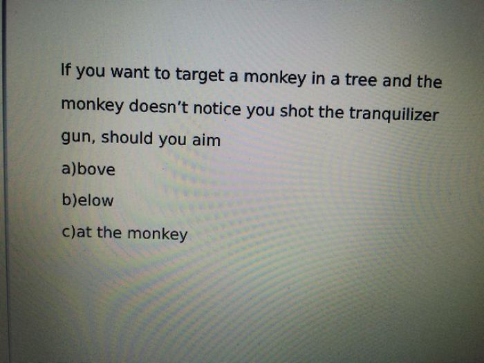
Image credits: justindi
#100 Printing Shop In My Home Town
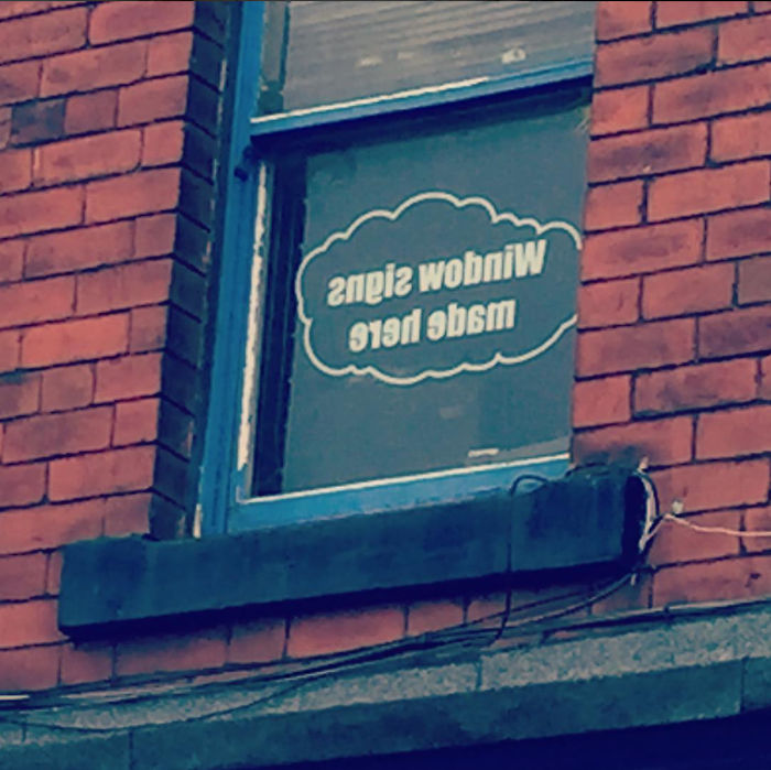
Image credits: boots_and_cats_
#101 The Official Emma Watson ‘beauty And The Beast’ Doll
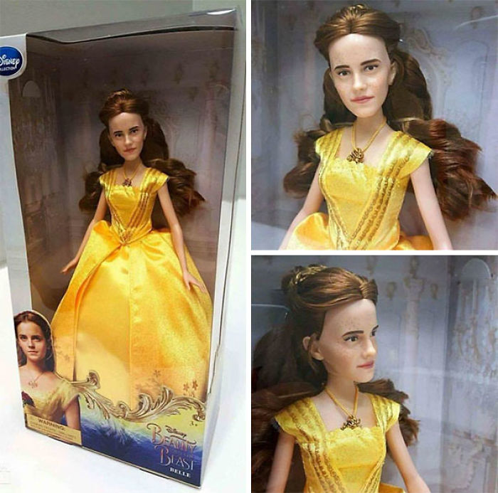
Image credits: Yzre
#102 Ho Ho Ho, Shit Down My Throat
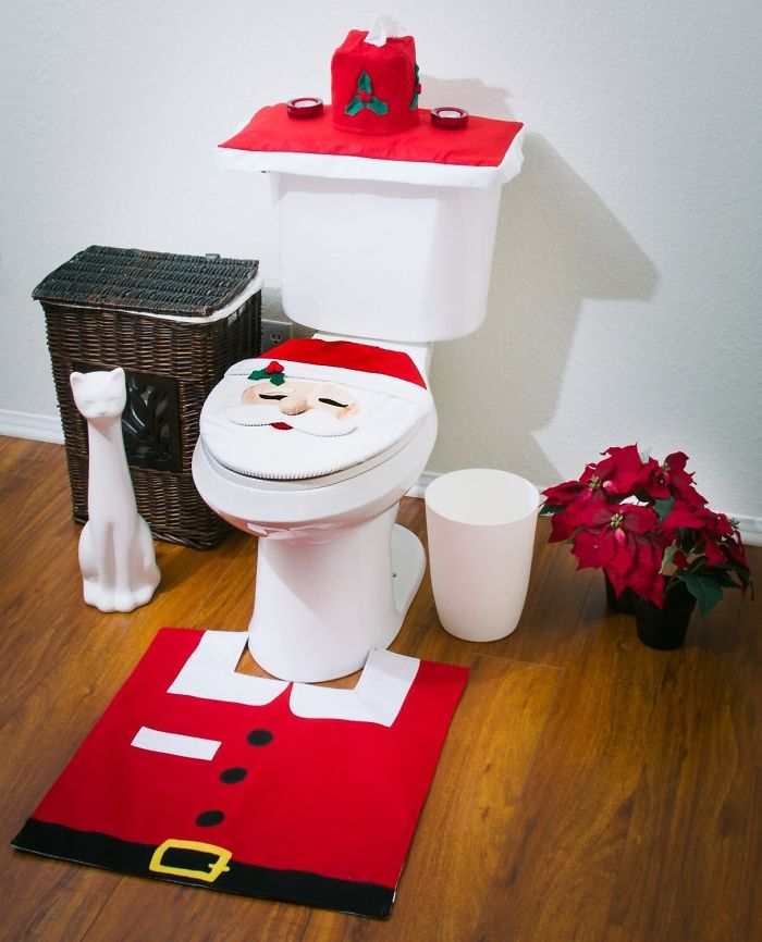
Image credits: PDwasHere
#103 Ndeeisgihgbnocrehnotoedr
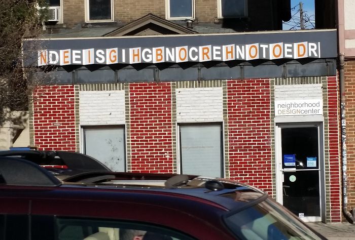
Image credits: RoscoeG
#104 Texcock Mextails
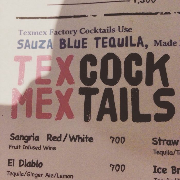
Image credits: smunchyblue
#105 Beautiful Driveway. Sucks You Can’t Use It
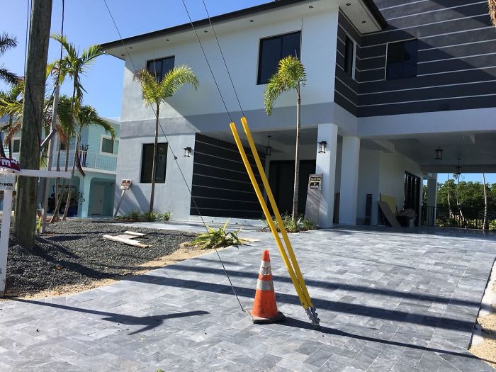
Image credits: AsASymbol
#106 This Slide With No Side Rails…
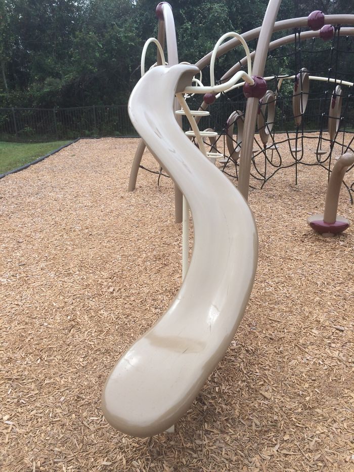
Image credits: STR4NGE
#107 Let’s Come Up With An Easy Acronym To Let People Know We Support The Military

Image credits: DonSquirrelio
#108 Literally Can’t Fall For This Scam
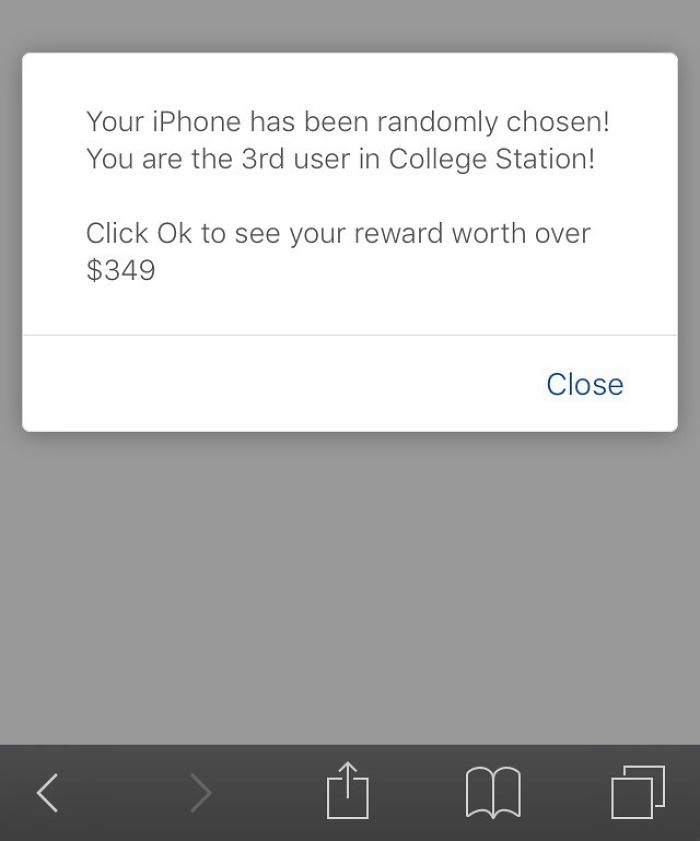
Image credits: Tramarius
#109 Stressed Backwards Spells…
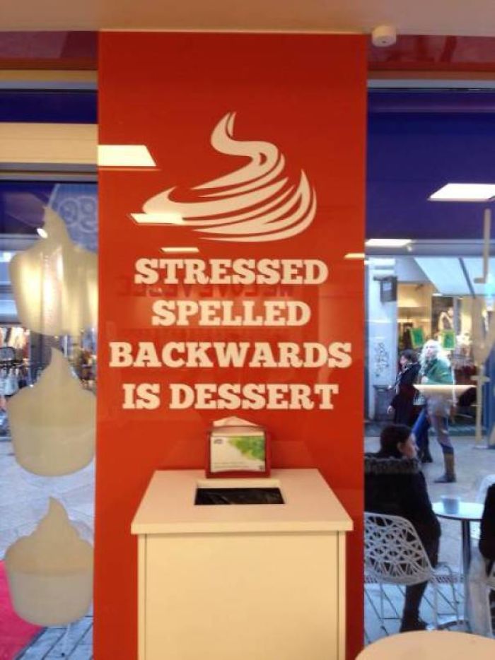
Image credits: MarcXJF
#110 Marketing Skills At Its Finest
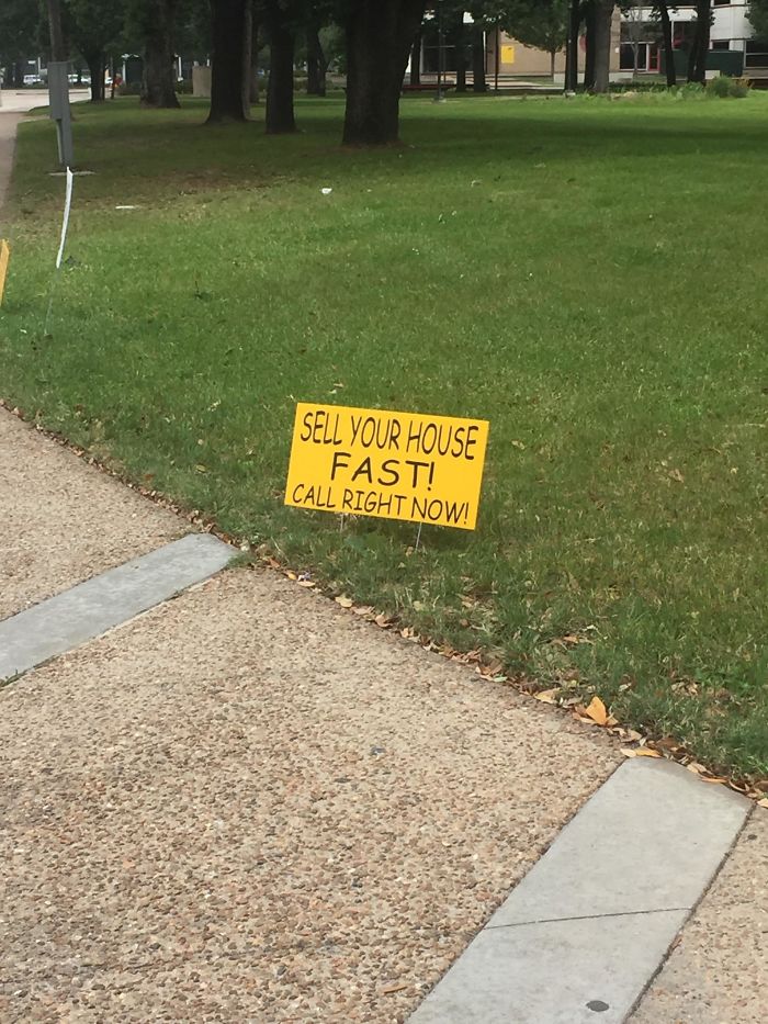
Image credits: ArbitraryEnigma
#111 While We’re On The Topic Of Awful Pool Design…
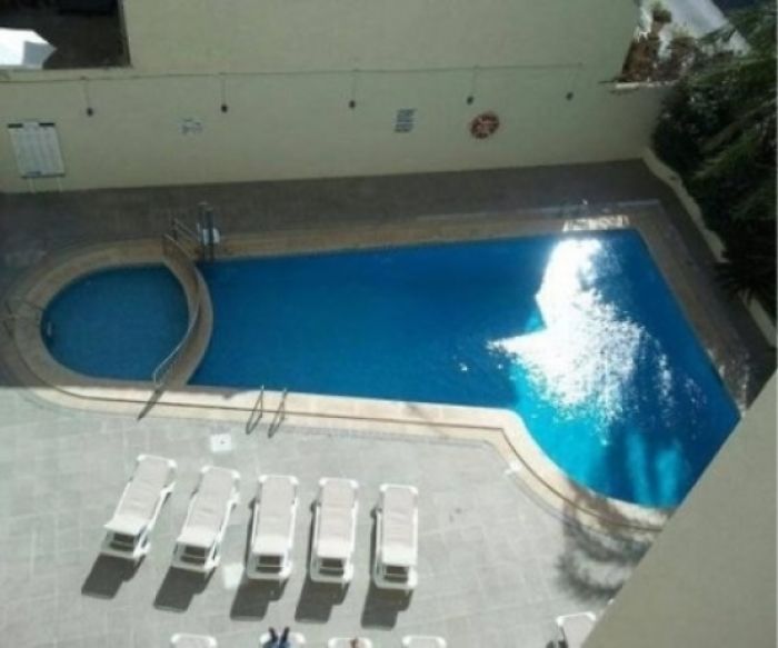
Image credits: ericsinsideout
#112 Heart Shape Headphone Splitter Looks Like A Nut Sack
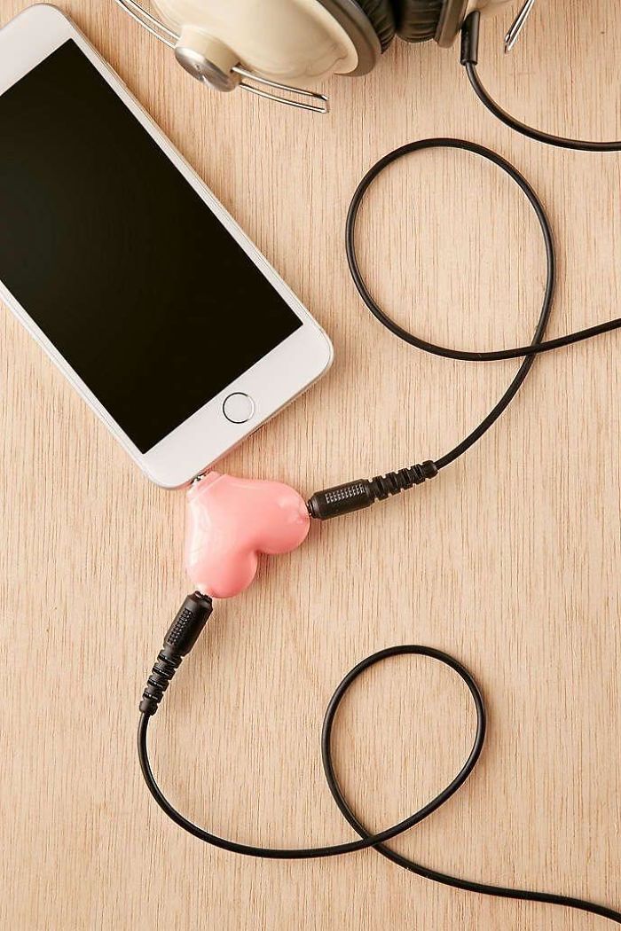
Image credits: sksksk1989
#113 Friend Posted This From A Lift In Vietnam
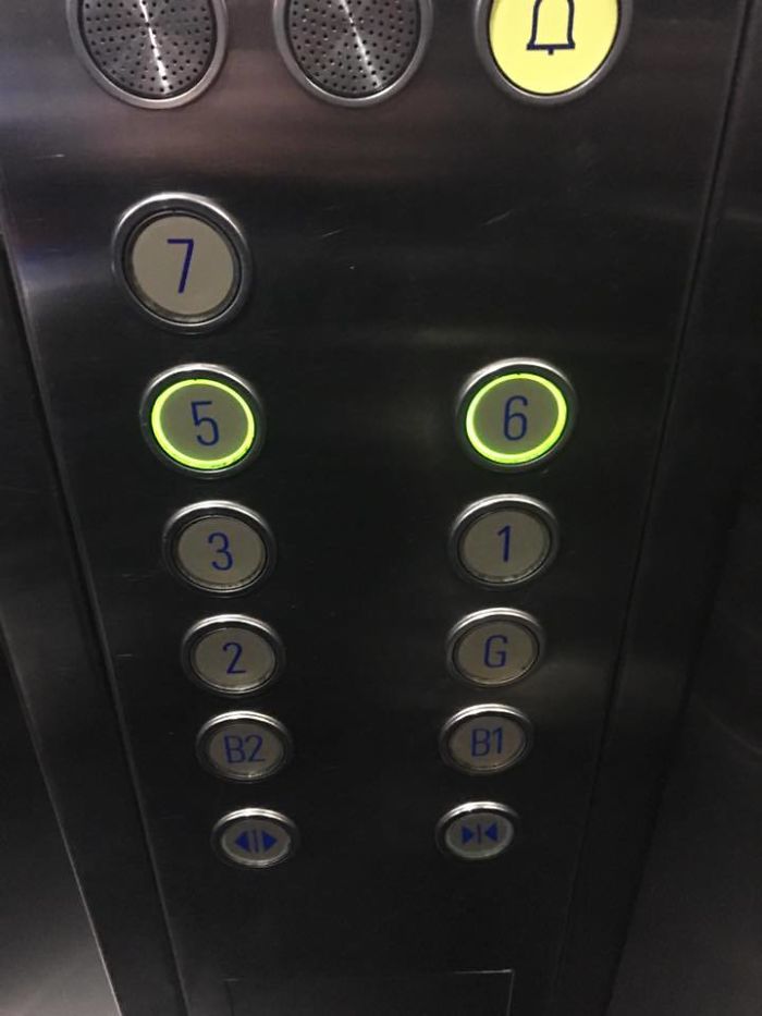
Image credits: Aaronponniah
#114 The Rails Should Prevent People From Hitting Their Head, But Instead They Trip Over Them. So Now, Traffic Cones
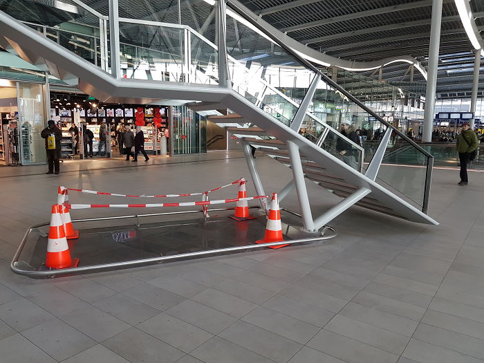
Image credits: domin8r
#115 The Eight In This Clock
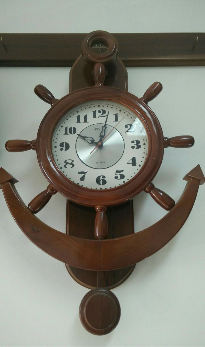
Image credits: macafeu88
#116 I Just Want To Heat My Hot Pocket
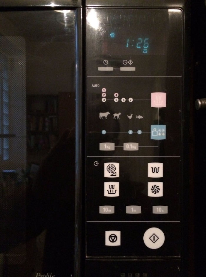
Image credits: coconutgoat
#117 Ate At A Local Restaurant
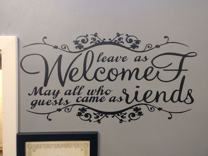
Image credits: Nopeasuoli
#118 These Hotel Room Directions
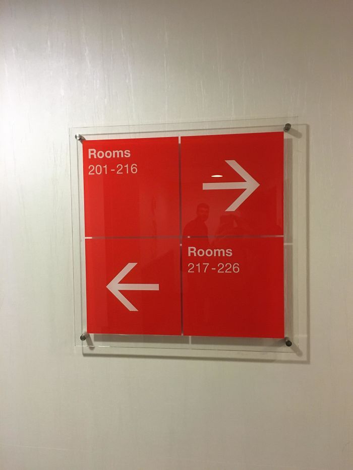
Image credits: phoenix772
#119 Do Love What You Do What You Love
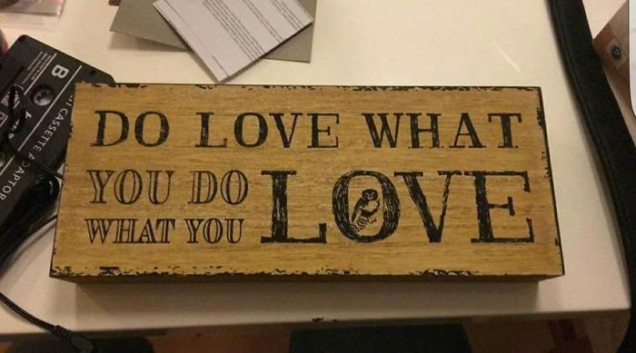
Image credits: alicecyan
#120 When Does The O’s Play?
Image credits: Swegerts
#121 This Woman Looking Out The Plane Is Very Calm Considering She’s About To Crash Into The Hudson
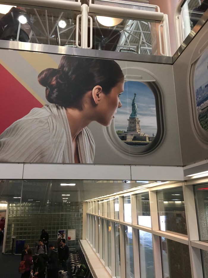
Image credits: bmdelaune
#122 The Awful Name Of This File
Image credits: GuD_MeMeS_OnLy
#123 The Stairs Leading To This Bedroom
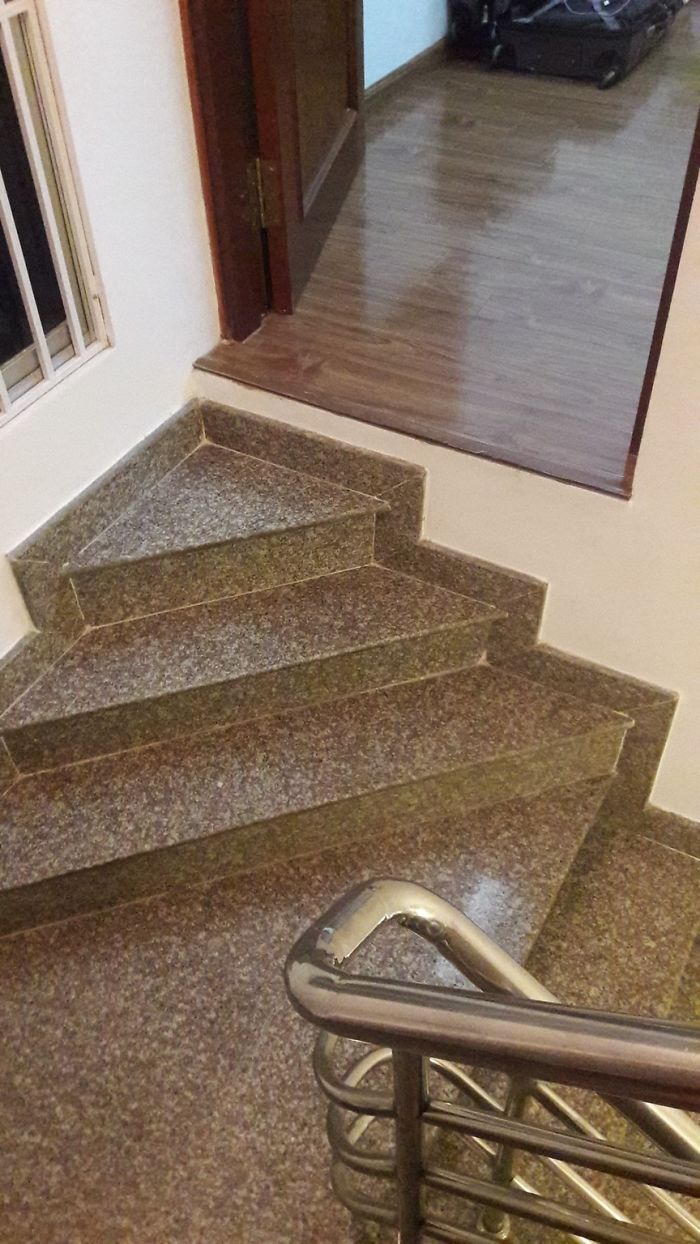
Image credits: reddit
#124 What
Image credits: gamebird8000
#125 There’s A Line Forming Behind Me. I Have No Idea
Image credits: samsuh
#126 This Watch Is Not Ez Read
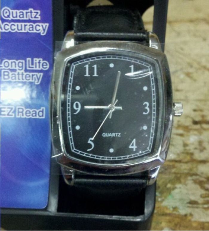
Image credits: SoonerVillage
#127 The Worst Thing About Lenovo Laptops. A “Close Current Page Without Warning Button” Right Next To The “Volume Up” Button
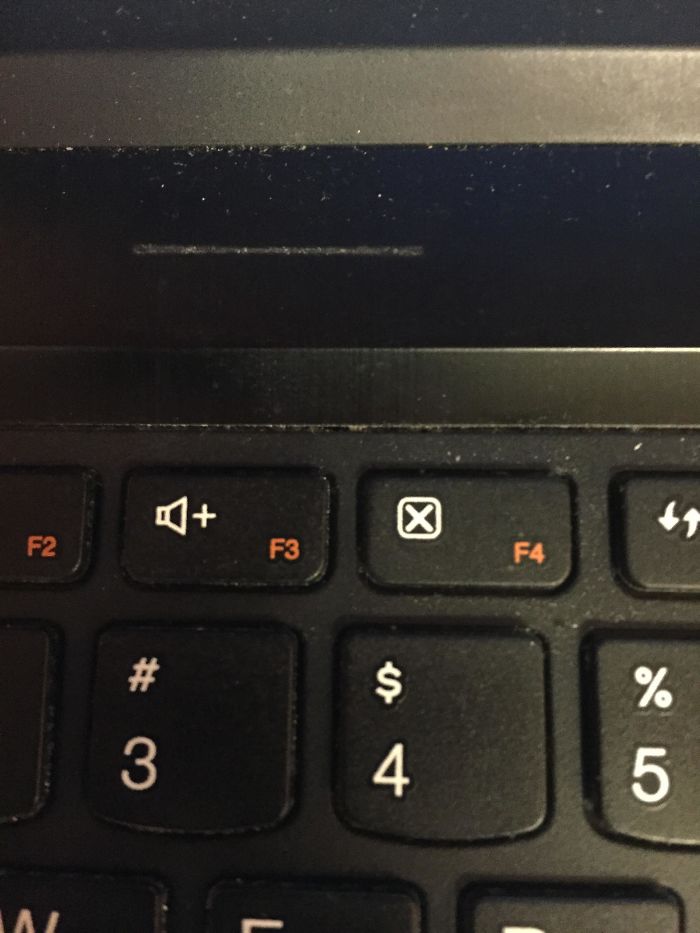
Image credits: srcw624
#128 That’s Like Asking To Get Your Speaker Kicked In
Image credits: Malfaisance
#129 1 2 3 4 5 6 7 8 Pgup 9
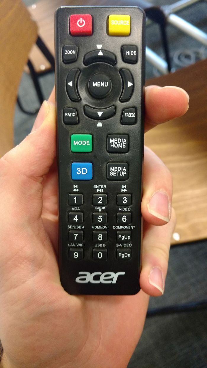
Image credits: tayomoore
#130 We Need A Poster That Says “Wine”
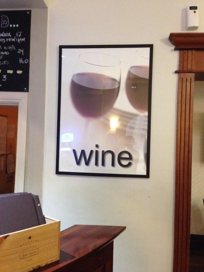
Image credits: NotBrenAgain
#131 In The Shadow Of Every Yes Is A… Different Shadow?
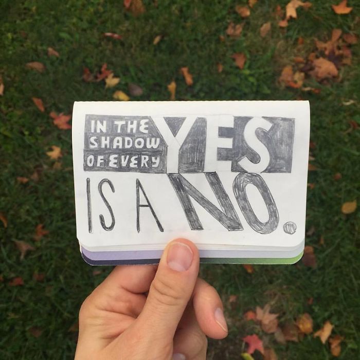
Image credits: Fineus
#132 My Gf Is A Teacher. This Sits On Her Desk And The Lack Of Punctuation Disturbs Me
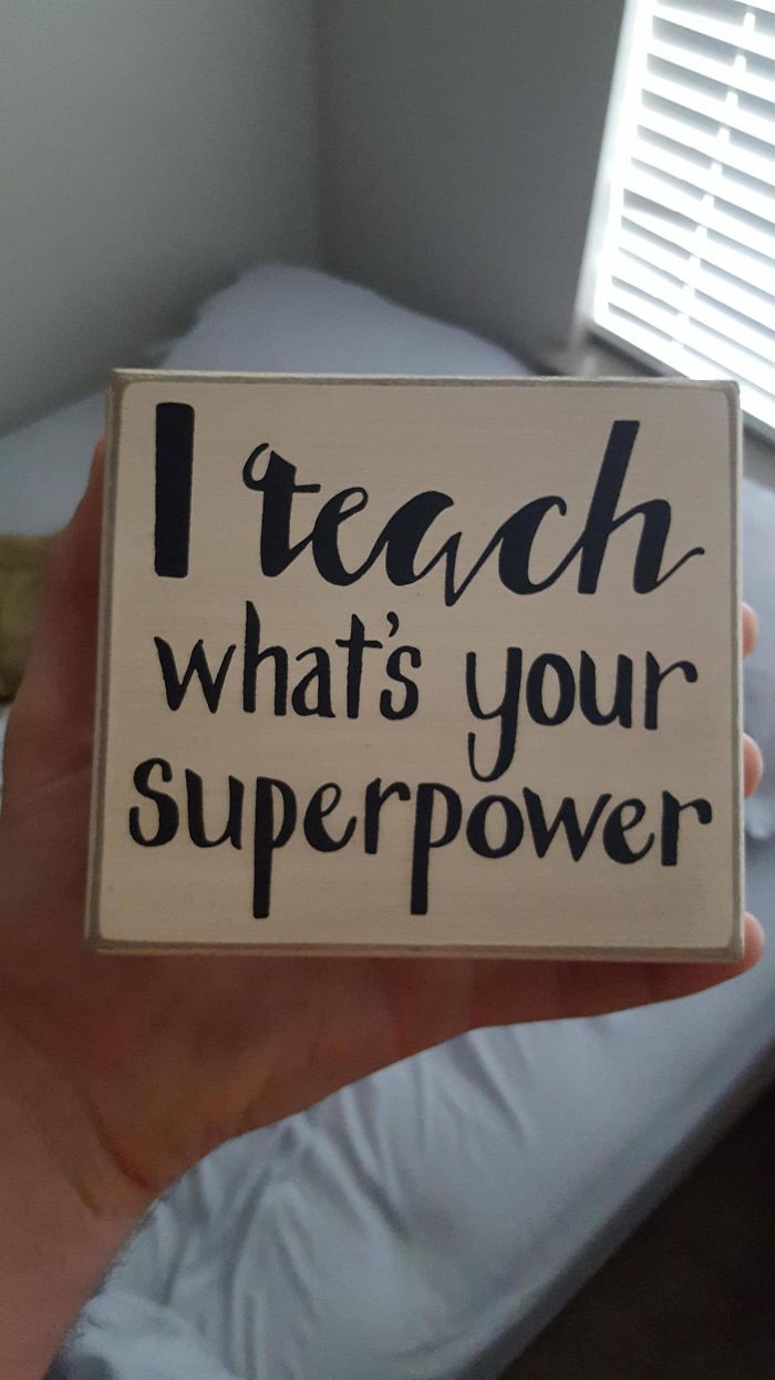
Image credits: mattym00
#133 This Door At My Dentist’s Office
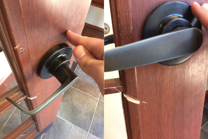
Image credits: Michael_The_Great
#134 Beer Coaster
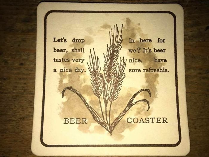
Image credits: _Hungry_Llama_
#135 I Made An Account Just To Post This Unforgivable De$ign Choice
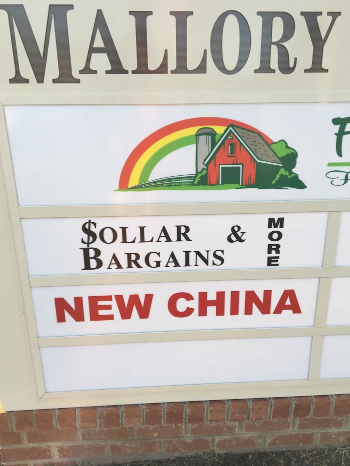
Image credits: The_Bronald
#136 This Sign

Image credits: rachgard
#137 Lots Of Hope For Sure
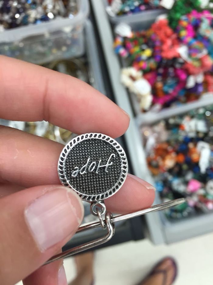
Image credits: s1lentstorm
#138 The Design School I Graduated From Sent This Postcard Out
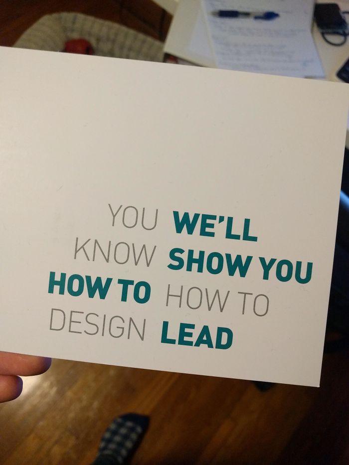
Image credits: edrini
#139 Give Up On Your Dreams
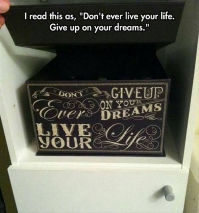
Image credits: Mage42384
#140 This Coat Rack
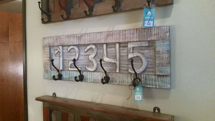
Image credits: bdevildds
#141 This Carpeted Bathroom
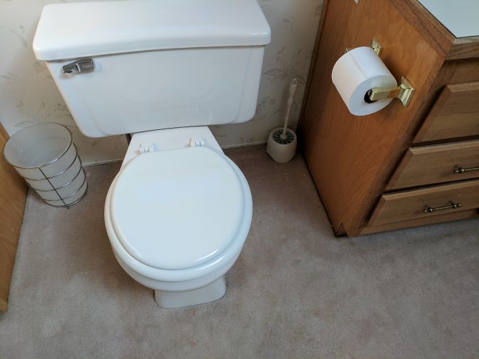
Image credits: cbigsby
50 Times People Encountered Such Over-Designed Things, They Just Had To Share
February 7, 2023
There’s good design. There’s bad design. And we can usually intuitively tell the two apart just by looking at it. But wait! There’s also ‘design design,’ a really weird category that straddles the line between quality aesthetics and truly awful taste. Some designers just don’t know when to stop designing their designy designs and go way overboard. Are we starting to sound redundant and over-complicated? Good, now you’re getting it!
The best (worst?) of these ‘designy designs’ end up being shared on the r/DesignDesign subreddit, an intriguing online community that both celebrates and criticizes these errr VeRy InTeReStInG aNd ArTiStIc ideas for products and furniture. We’ve collected some of the most bizarre and original pics to share with you, Pandas.
Scroll down, upvote the designs that really had an impact on you, and if you love what you see, consider becoming a member of the subreddit.
Bored Panda reached out to Matt Johnson, Ph.D., the host of the Consumer Psychology Blog and the Human Nature Blog, for a few insights on the importance of finding the right balance between the designer’s vision for their product, as well as what would appeal to consumers. He told us that, at its core, user experience is about empathy. Johnson is a professor of consumer psychology at Hult International Business School and Harvard University, and the author of ‘Branding that Means Business.’ Read on for our interview with him.
#1 Wall Outlets With Extension Cords Built Into The Wall
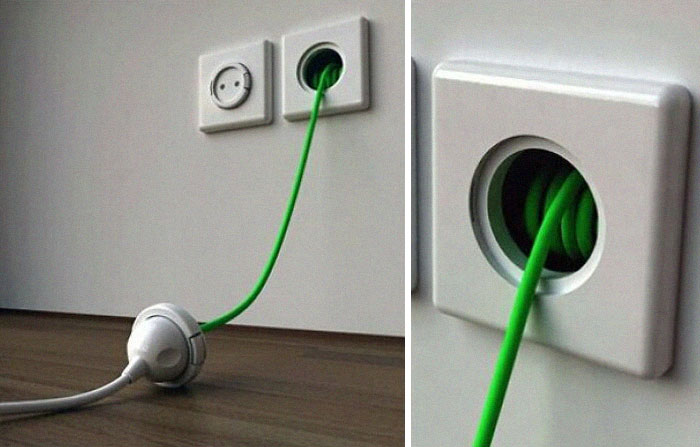
Image credits: joeepeterson03
#2 Stacked Seating At A Restaurant
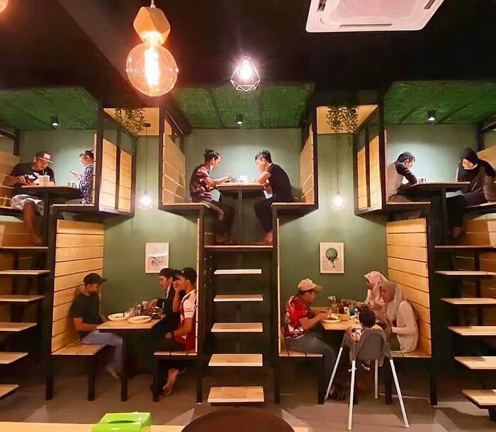
Image credits: Xerxes2004
#3 Found On The Designp**n Frontpage
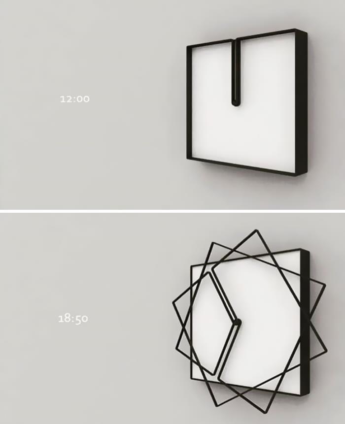
Image credits: Ryzasu
We were interested to learn more about the balance between what a designer wants from their product and what consumers look for. We asked Professor Johnson about what can help designers maintain a more grounded, user-friendly perspective.
“Ultimately, good UX is an act of empathy. You have to filter your creative vision for the product through the lens of the consumer’s needs, unique preferences, and tendencies. This means creating a balance between your own aspirations for the product (e.g. what you think it could be), and how it will intuitively seem to the end user (how the user will actually be used),” he explained to Bored Panda.
“Practically speaking, by inviting the consumer into the design process and getting feedback along the product development journey, the end result is much more likely to strike this balance.” However, if there’s only poor communication, you might end up with a disconnect between the two. Something that Piterskii-Punk-Wall accurately showed in their comic right over here.
#4 Hidden Fire Extinguishers
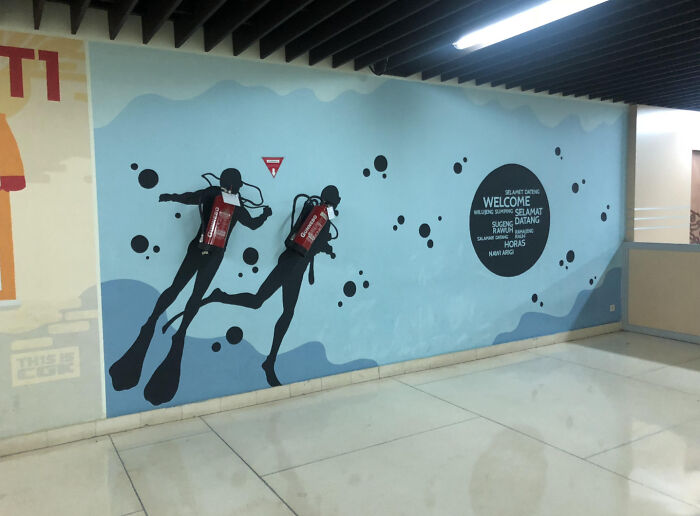
Image credits: peter-s
#5 A Nature Inspired Bathroom
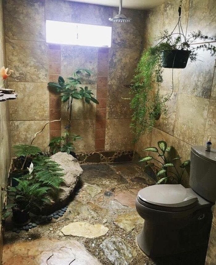
Image credits: TheBrontosaurus
#6 Ok I Think I Found The Ultimate Decanter. This One Keeps Me Awake At Night
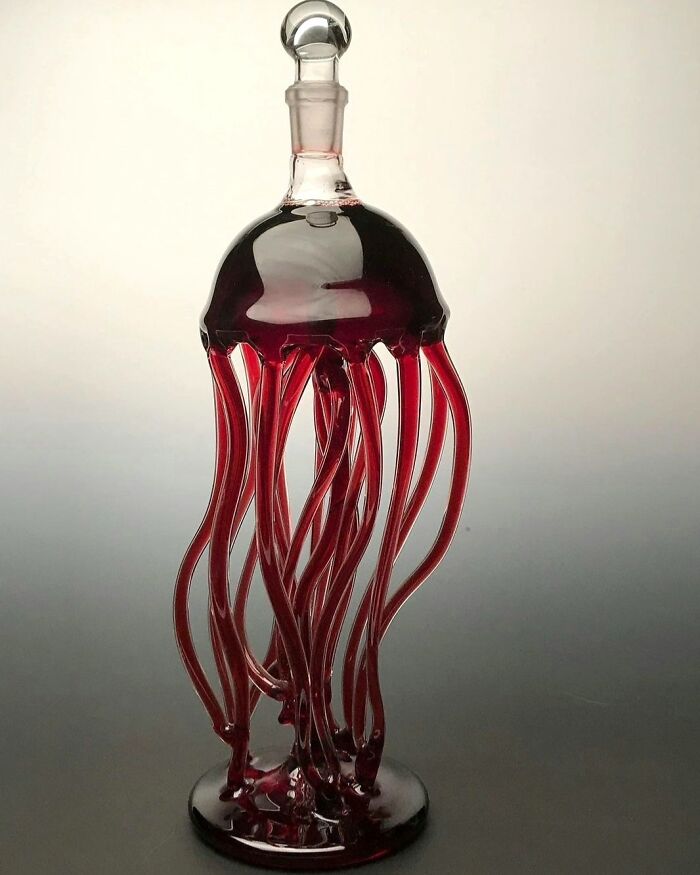
Image credits: living_legend6
Johnson, the host of the ‘Neuroscience Of’ blog, told Bored Panda that the best and most beloved products integrate both perspectives: that of the designer, as well as of the consumer.
“If the balance is tilted too far in the direction of the creator’s vision, as opposed to the user’s intuition and needs, it comes off too much as a standalone work of art, and not as a functional product,” he said.
“This feels immediately obvious to the consumer: it’s something that reflects an idea from a specific individual, but lacks the necessary translation to the broader world. In a word, it feels too much like ‘art,’” the professor told Bored Panda. He noted that this is perfectly fine and valuable in its own context. However, when it comes to the world of consumer products, there’s a necessity for this additional layer of consumer empathy.
#7 Drink The Rainbow
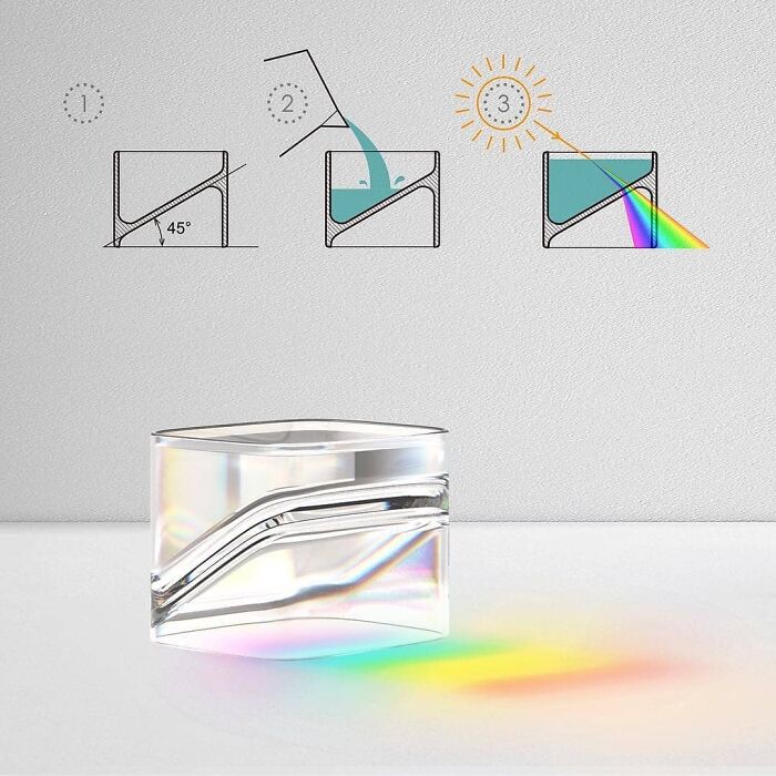
Image credits: AgainstTheAgainst
#8 Imagine Going Through All The Trouble Of Publishing Just To See This
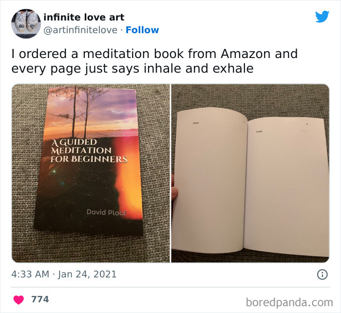
Image credits: unicodePicasso
#9 Another Silverware Set… Another Useless Spoon

Image credits: elrolo123
As we see it, there are two main issues at play here when we’re talking about designy designs, aka over-designed products. Both explain, at least in part, why some creative professionals go completely overboard.
The first is a question of theory vs. practice and how even the best-laid plans don’t necessarily translate into reality. The second is about the relationship between the designer and their (real or imagined) audience—aka the end-users and consumers.
You might have an utterly amazing idea for a product or piece of furniture in your mind. Maybe you’ve even sketched it out! But even though the concept looks amazing on paper, it might not be the best fit for consumers. Something that any creator would be terrified to learn only after launching the idea into the market.
#10 Door Knob Design That Gives You A Fish Eye View Of The Room Ahead
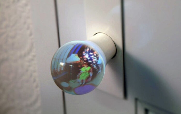
Image credits: Immortalizd
#11 Possibly One Of The Worst Staircases I’ve Ever Seen
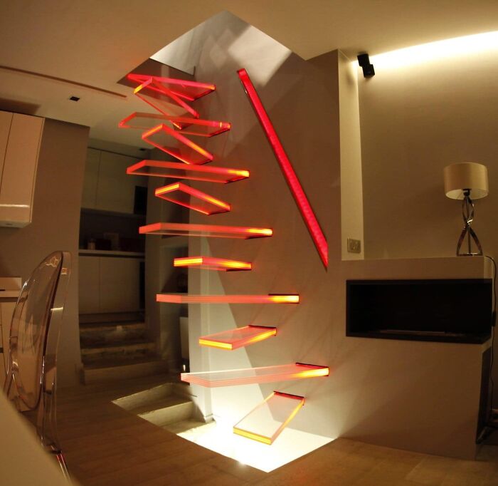
Image credits: FastGinFizz
#12 Holy F**king S**t
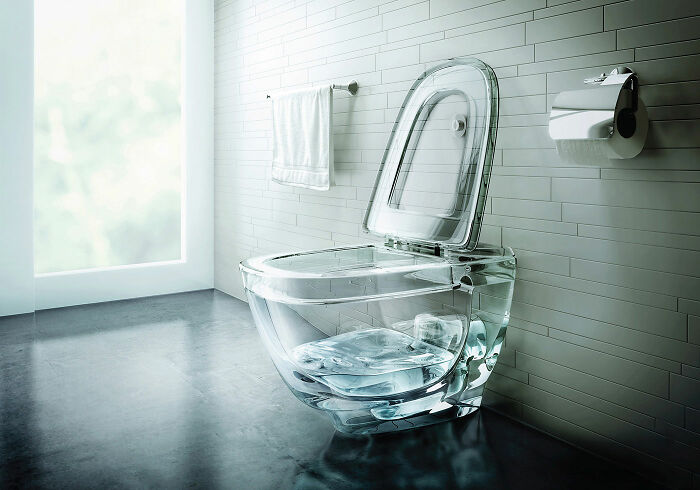
Image credits: reddit.com
Maybe what you’ve come up with is more akin to art and is radically impractical to use every single day. Or the item is incredibly complex and unintuitive to the average shopper on the highstreet: something that you might not realize because you’ve spent so long on the design, you know it like the back of your hand. It’s a case of design short-sightedness where the professional can’t see the forest for the trees.
Meanwhile, the professional in charge of designing the product might be completely disconnected from their intended consumers. This might happen due to a lack of information on buying trends or because of less-than-stellar communication between them and their customers. That means that the designer is essentially stuck inside a bubble with only their own ideas to consider, with very little (if any!) outside feedback.
#13 Swinging In The Conference Room
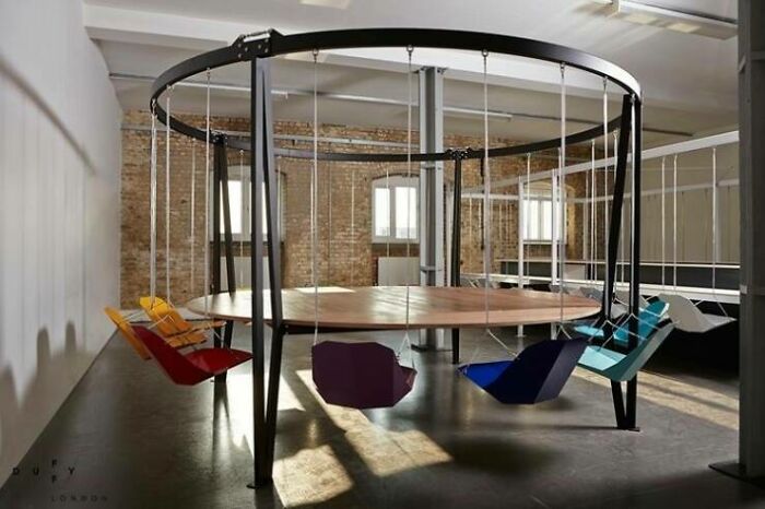
Image credits: Dr_Zol_Epstein_III
#14 A Banana Slide That Trains Your Determination. If You Get Lost, Your Crotch Will Die
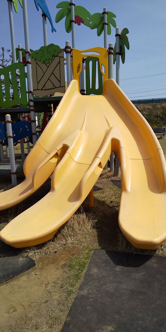
Image credits: DonnySRT-10
#15 No Way This Can Go Wrong
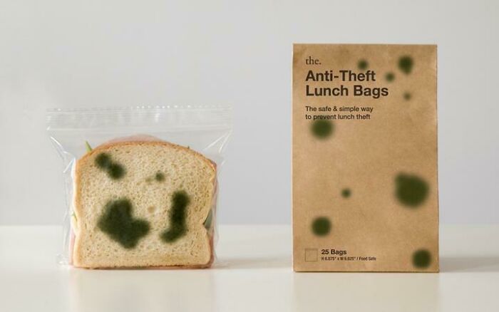
Image credits: R1m1s4k
However, another possible explanation for this disconnect between designers and consumers can be attributed to a more human factor. Namely, arrogance. It’s perfectly fine, even praiseworthy, that you’re confident about your work and that you feel pride in what you’ve achieved. Unfortunately, this can sometimes overshadow the end goal of what’s being sold, namely, that people want to buy and use what you’re offering.
Perhaps the creator feels like they have far better taste than the would-be buyers. So they want to ‘enlighten the masses’ (or something equally as pompous). Here’s the thing, though. Even if it’s a well-intentioned idea to want to educate people about good taste, there are different ways to go about it.
To put it mildly, it’s not the best idea to go about bragging to everyone how much more educated and intelligent you are while poking fun at them for being tasteless. However, when you come from a place of humility and a genuine desire to help, others are more open to what you have to say.
#16 A Car Fender Bicycle
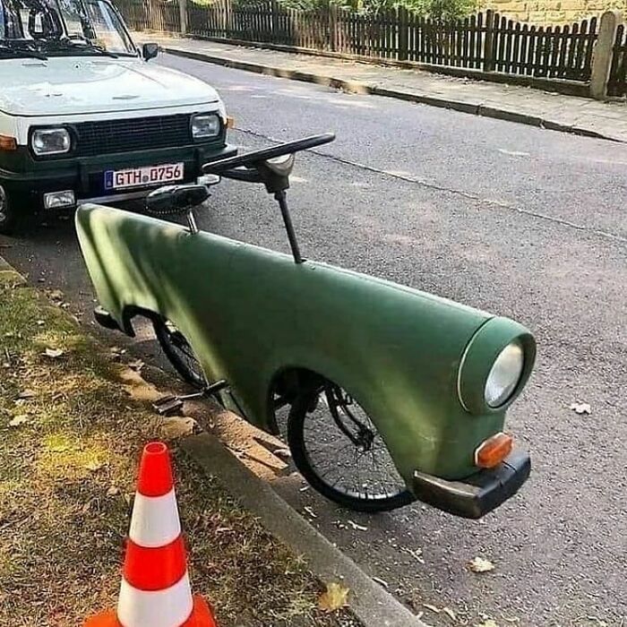
Image credits: VOTROI
#17 This Is The New University Building Of Freiburg That At The Same Time Blinds The Road Traffic
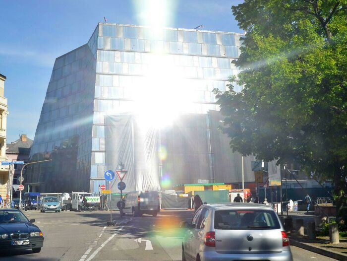
Image credits: schalker1207
#18 Apartments In Amsterdam
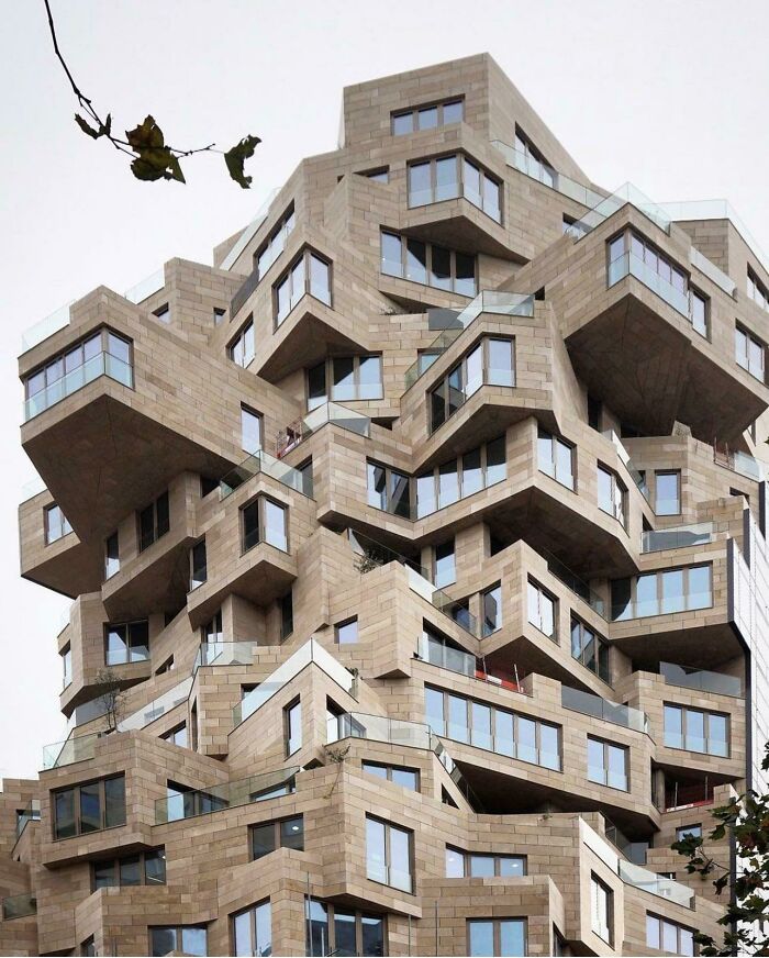
Image credits: spitzyyy
At the same time, no matter how successful and well-received a designer’s work might have been in the past, it doesn’t guarantee that their next idea will be good. Multi-functional furniture might not have the mass appeal that they hope it will, meaning it’ll remain a niche product for very niche buyers.
Similarly, even if your lovingly-crafted set of cutlery is pleasant to look at, it might be utterly atrocious to eat with, so you’re left with a decorative piece that very few people actually like.
#19 Books And Bath
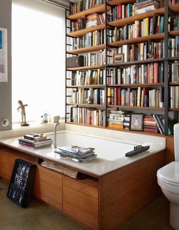
Image credits: hannahwith
#20 Injury Attorney’s Dream Staircase
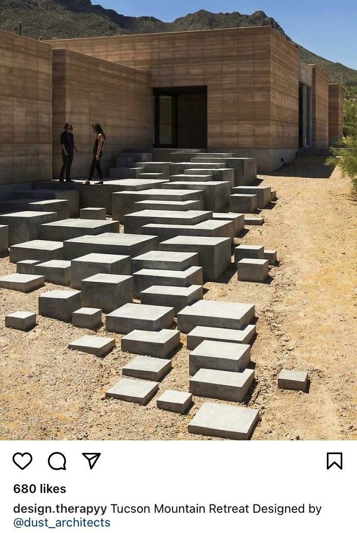
Image credits: CaptainCaptain17
#21 Imagine What It Looks Like In Fall
Image credits: VexuBenny
The r/DesignDesign subreddit was founded a few years ago, in mid-July of 2018. Since then, they’ve amassed a following of 120k redditors. The moderators running the whole show stress the fact that the pics shared by the members of the community have to be, at the same time, examples of good and awful design. There should be a balance between the two.
#22 Just No
Image credits: Grown_Ass_Kid
#23 Found On Fb… I Can Hear This Image
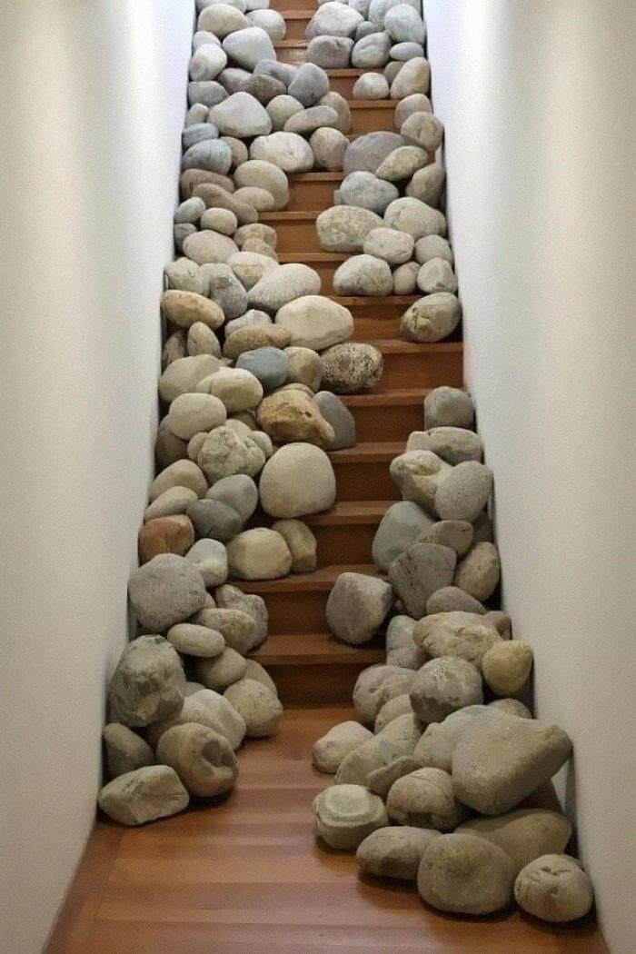
Image credits: 12welveCreations
#24 Just No
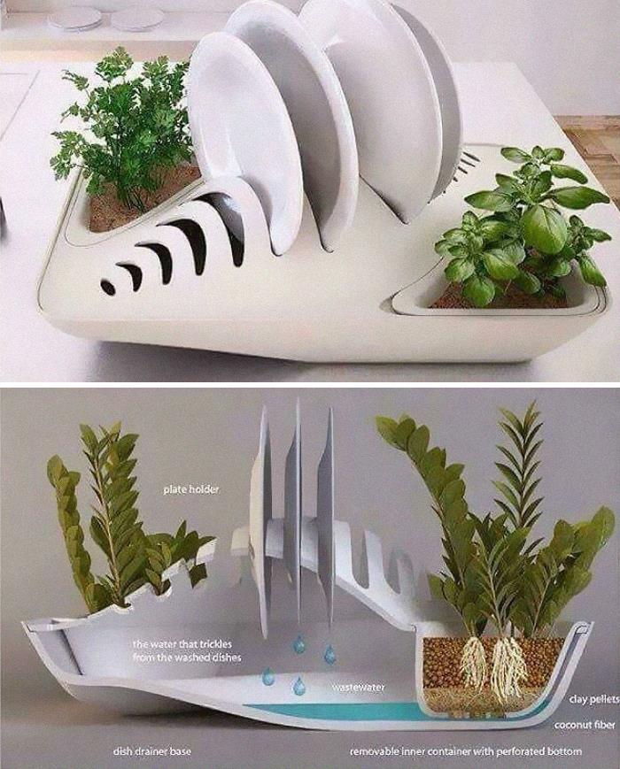
Image credits: DavyBoyWonder
Meanwhile, the mods also ask their members to avoid reposting other people’s photos too much. “Reposts are OK as long as the post hasn’t been submitted in 6 months or more than 3 times,” they set out the rules. That way, the content’s kept fresher and it helps avoid people farming attention just for the sake of attention.
#25 Let Me Just Find My Keys
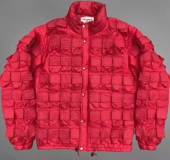
Image credits: braveNewWorldView
#26 Splash-Proof Urinals
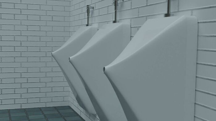
Image credits: Ok-Antelope9334
#27 This Hallway Must Have Looked Awesome On The Blueprints
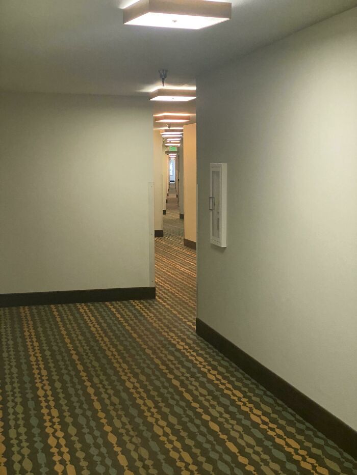
Image credits: mcwiggin
Broadly speaking, taste might be subjective (e.g. preferences for minimalism or maximalism), but there are many things that we can agree on that do and don’t make much sense. If a product is user-friendly, ergonomic, intuitive to use, and matches our expectations, then we can say that it’s an example of good design.
#28 Oh Yes, Reverse-Lamp
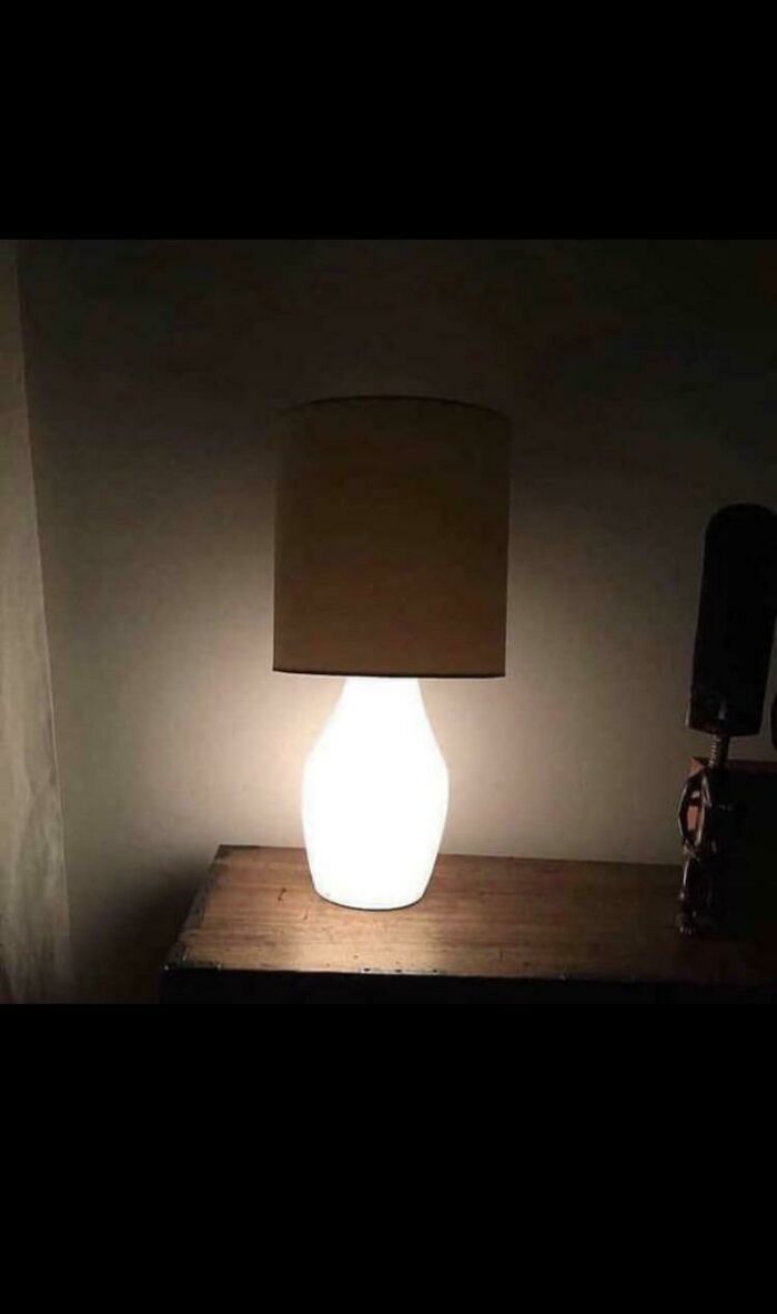
Image credits: Matuteconsuaj
#29 These Would Be Awful To Use
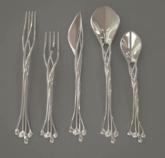
Image credits: mossycavities
#30 A Balcony Without Sun Or Fresh Air Is Just A People Shelf
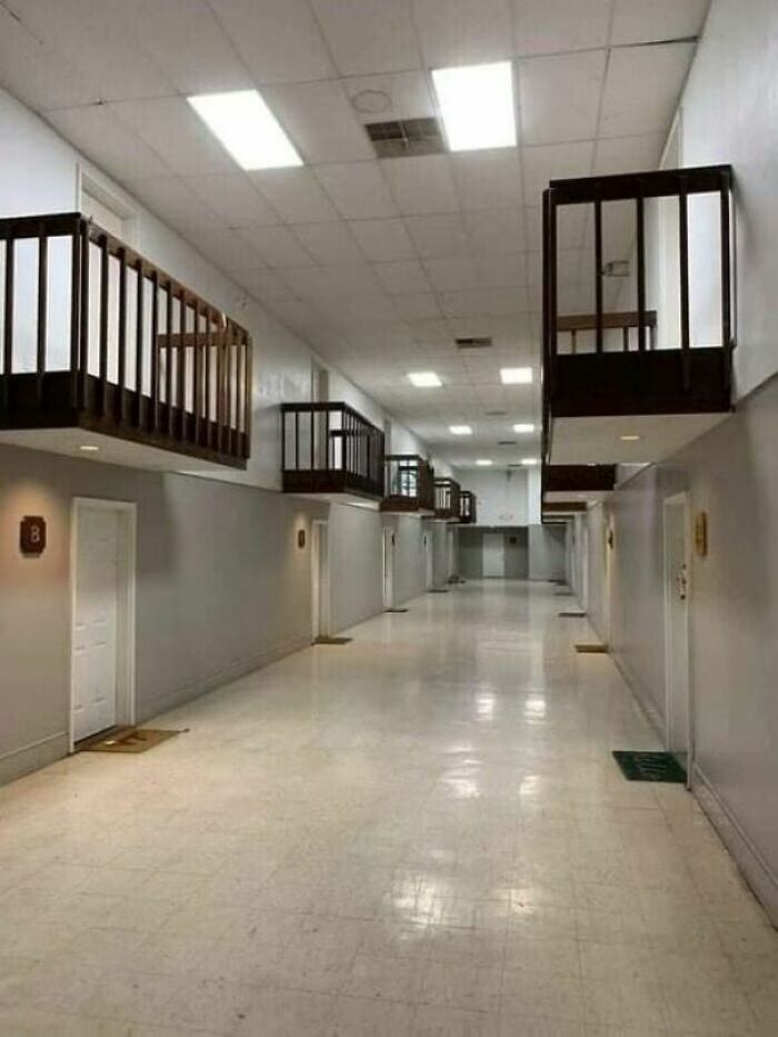
Image credits: WithaK19
On the flip side, something that’s more like a puzzle that requires an IQ of 160 to figure out won’t get many smiles from the crowd (unless they bought it specifically because they love over-designed, over-complicated stuff). Put the user first and you can’t go wrong. Put your designs above them and you might end up in the grey zone where quality and awful taste meet.
#31 Does This Count?
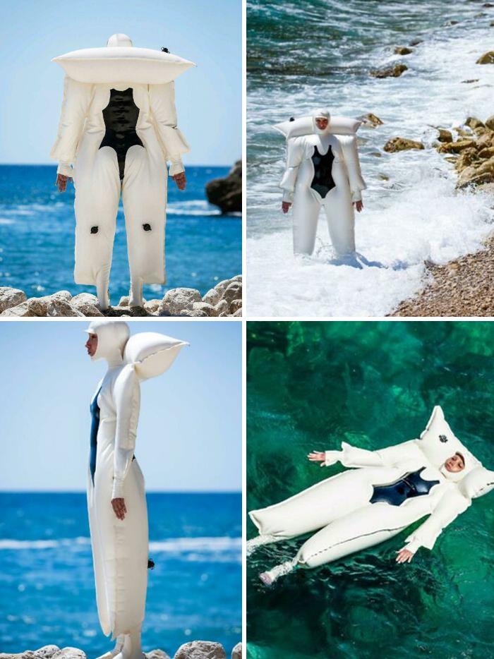
Image credits: DavyBoyWonder
#32 This Fire Pit That Doubles As A Side Table When You Tip All The Ash On The Floor
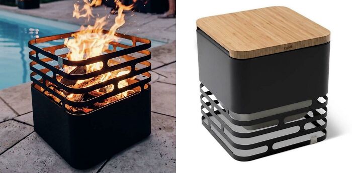
Image credits: OhoBenderez
#33 For Me, The Juicy Salif Is The Pinnacle Of Design Design
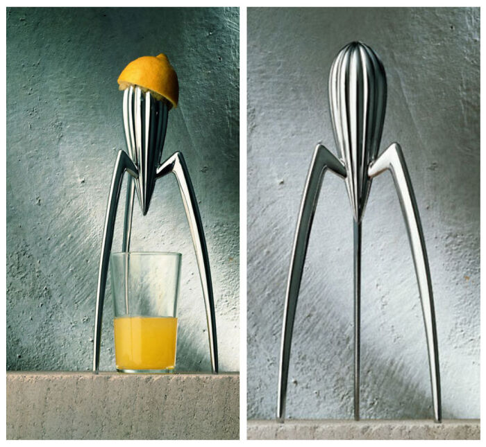
Image credits: Willch4000
#34 Reinventing The Pint
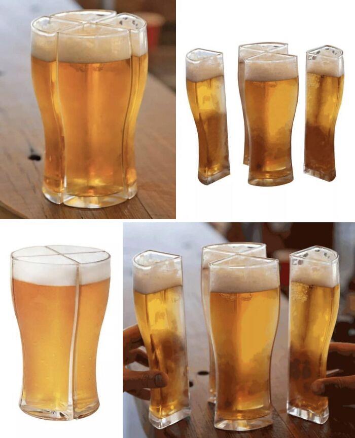
Image credits: zeph_yr
#35 Why? Just Why?
Image credits: MIRIIE
#36 Thanks I Hate It
Image credits: Tacklefina
#37 When You Want The Guarantee Of A Broken Neck From Your Staircase
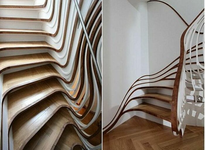
Image credits: Helpful-Substance685
#38 Clocks
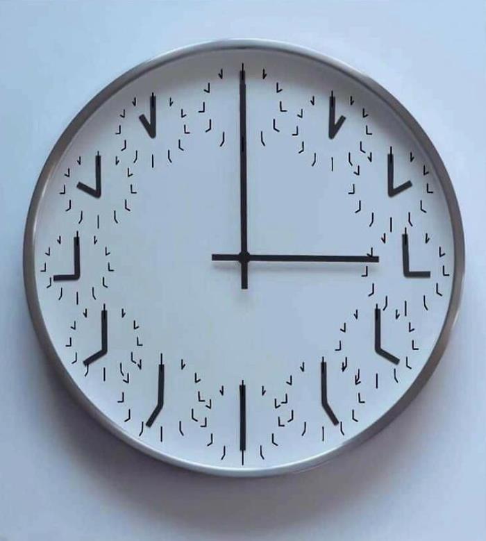
Image credits: jesset77
#39 Because A Hat Would Be Far To Complicated
Image credits: echis
#40 The Lucky Knot Bridge In China
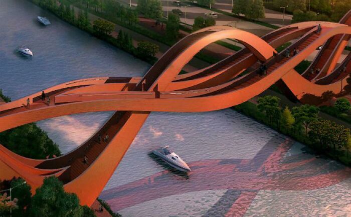
Image credits: reliseak
#41 This Sink. Spotted On A Facebook Ad
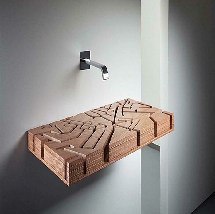
Image credits: reddit.com
#42 W Fart Free Water
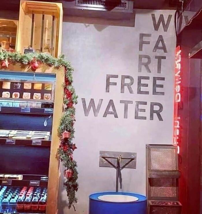
Image credits: 20-CharactersAllowed
#43 A Bookshelf To Store Some Pebbles Or Something
Image credits: 2roK
#44 This Luxurious Toilet

Image credits: markkobarr
#45 That Looks Comfortable
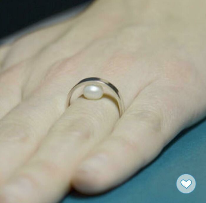
Image credits: ffrsh
#46 Love Designy Cumbersome Roundware
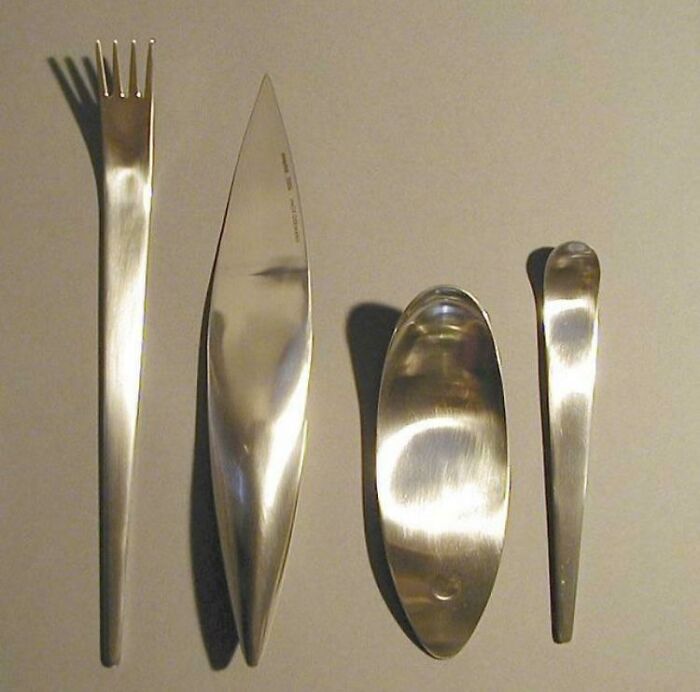
Image credits: Used_envelopes
#47 Dear God I Just Needed To Pee
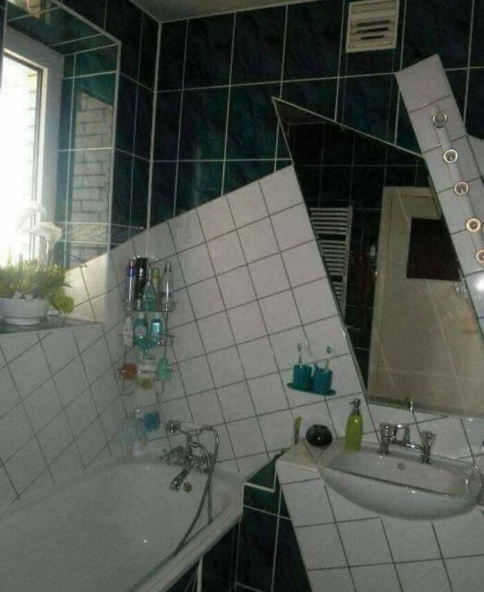
Image credits: mastermithi29
#48 A Maze Of Concentric Circles On The Back Of The Phone Fitting Its Earphones Perfectly
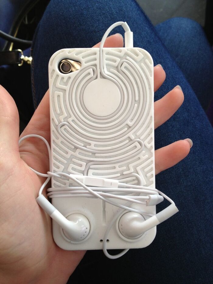
Image credits: airkiko
#49 Saw This On Insta
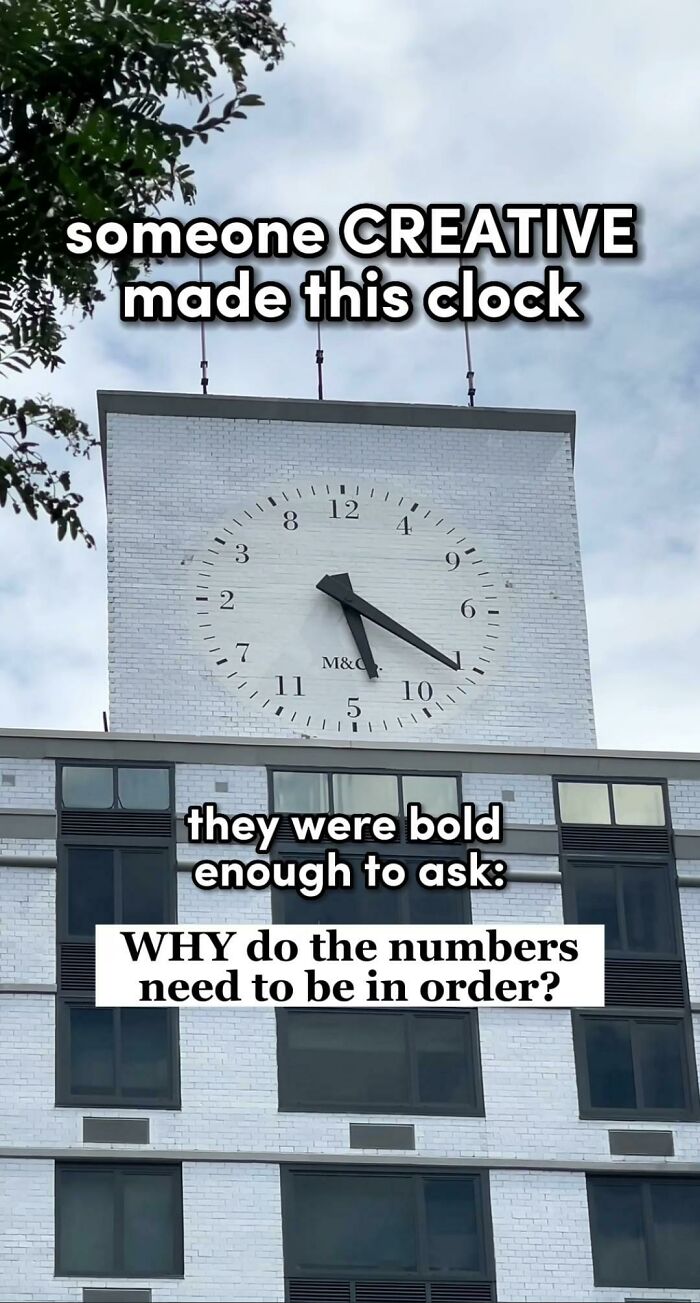
Image credits: paulekas_
#50 Stock Market Bench
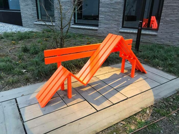
Image credits: joshart
‘That’s It, I’m Architecture Shaming’: 40 Architecture Examples That Look So Bad, People Just Had To Shame Them
May 7, 2021
Some buildings will absolutely fascinate you with their stunning designs, genius architectural decisions, and the sheer power of their aesthetics. This article isn’t about these kinds of buildings, however. Nope! Not all buildings are made equal, you see, and the ‘bad’ ones need to be shamed publicly so that others don’t copy their designs. So we’ll be focusing exclusively on just plain terrible architectural decisions.
And the worst of the worst end up on the ‘That’s It, I’m Architecture Shaming’ Facebook group where users mercilessly prod and poke bad design. It’s fun, it’s educational, it’s something cool to scroll through during your next coffee break.
Remember to upvote your fave photos that you love to hate and be sure to follow the architecture-shaming Facebook group if you like their stuff. They’re a growing community with awesome content.
Bored Panda spoke about what separates good and bad design, the need to democratize the access to quirky private property designs, as well as about the roles that architecture plays with an expert in the field from Sweden who has a background in urban planning. You’ll find our full interview with her below.
#1 I Dunno, Slim Doesn’t Seem To Be Digging This Situation
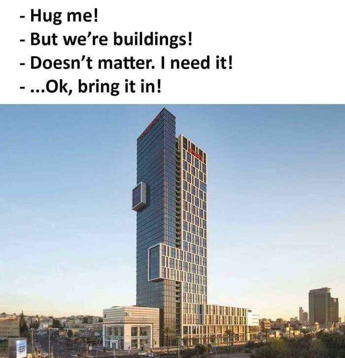
Image credits: architectureshaming
#2 I Do Not Give A Damn How Well It’s Cantilevered Or How Strong The Struts Are. I Do Not Have The Kind Of Luck It Would Take To Set Foot In This House
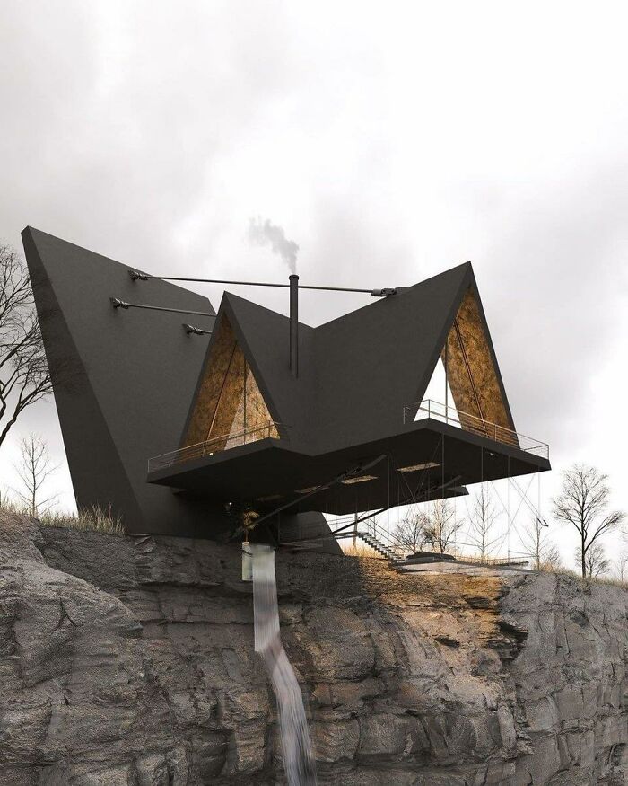
Image credits: architectureshaming
#3 This Pillar Was Straight Last Week. This Is The First Floor Of A Seven-Floor Building
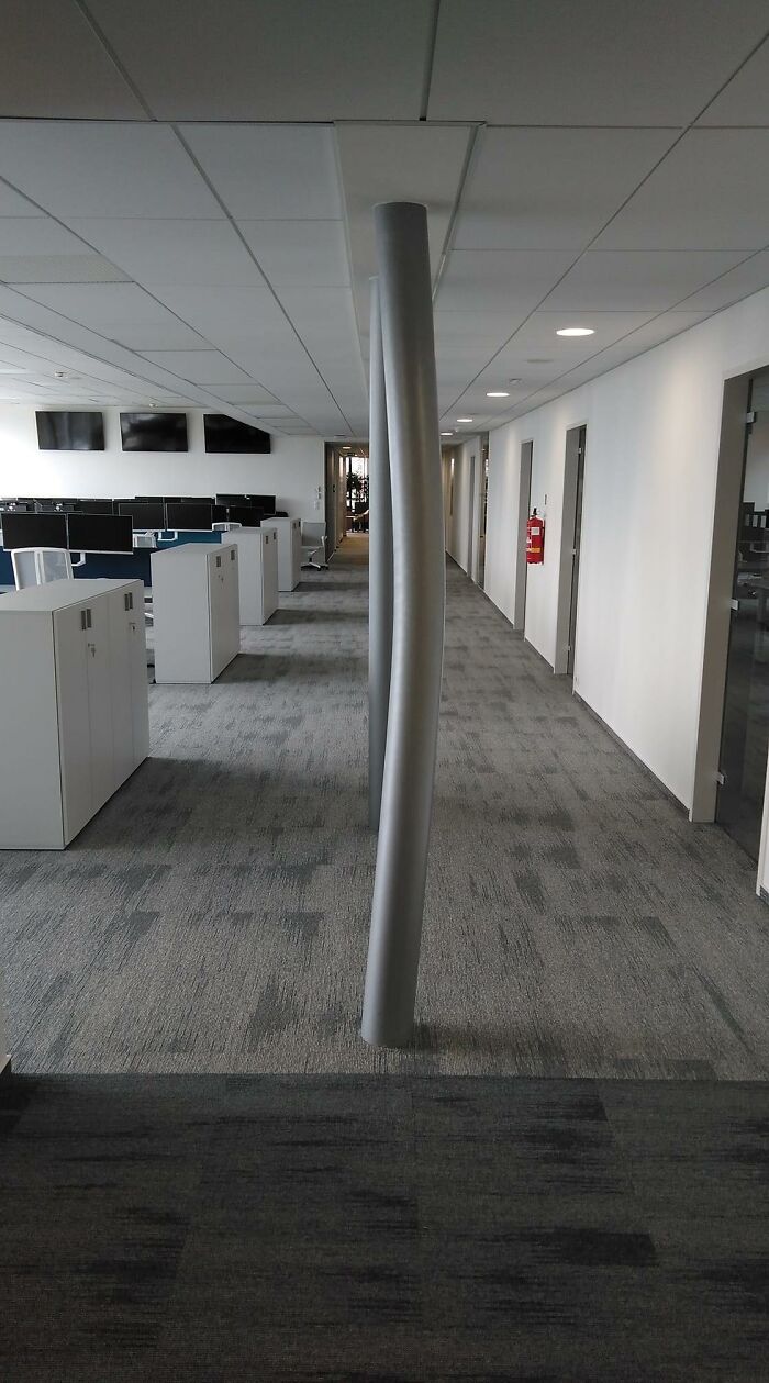
Image credits: architectureshaming
The Sweden-based urban planning expert explained to Bored Panda that while public spaces must meet safety and accessibility standards, aesthetic standards can be much more fluid for buildings. The expert spoke to Bored Panda on the condition that she remain anonymous. (Remember, just because you’re an expert in something and want to be helpful doesn’t mean that you always like the limelight… unlike quirky architecture which just begs you to look at it!)
“Most of the time, the elements of the built environment should be in harmony amidst each other and with the surroundings. However, sometimes, something bolder and out-of-the-box might form an engaging contrast,” she said. However, the urban planning expert shared with Bored Panda that, in her personal opinion, our built environments have to engage us, as well as stimulate our minds and senses. In fact, she believes that architecture’s ability to make us think is one of its most powerful aspects.
#4 The Cactus Is *chef’s Kiss
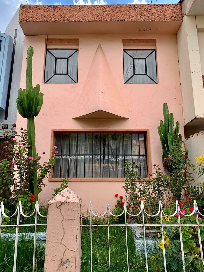
Image credits: architectureshaming
#5 This Is Not Photoshopped
Image credits: architectureshaming
#6 Opera And Ballet Theatre Of Cheboksary (Russia)
Top: original picture
Bottom: slightly photoshopped picture
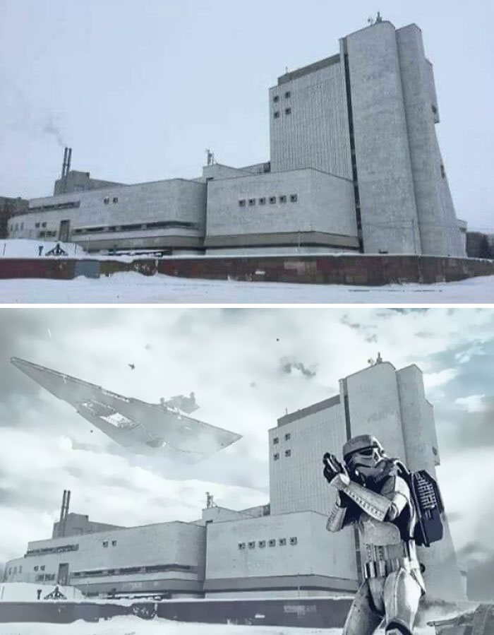
Image credits: architectureshaming
“There are circumstances where the architecture should create a sense of calmness and safety, yet there are instances in which it is not bad if the architecture provokes us and makes us think, ‘Why don’t I like the look of this building?’”
The urban planner said that we should give people the freedom to express themselves as they wish when it comes to designing their private property. As long as they have the means, nearly everything is allowed, in her opinion.
#7 That Gives Me Anxiety
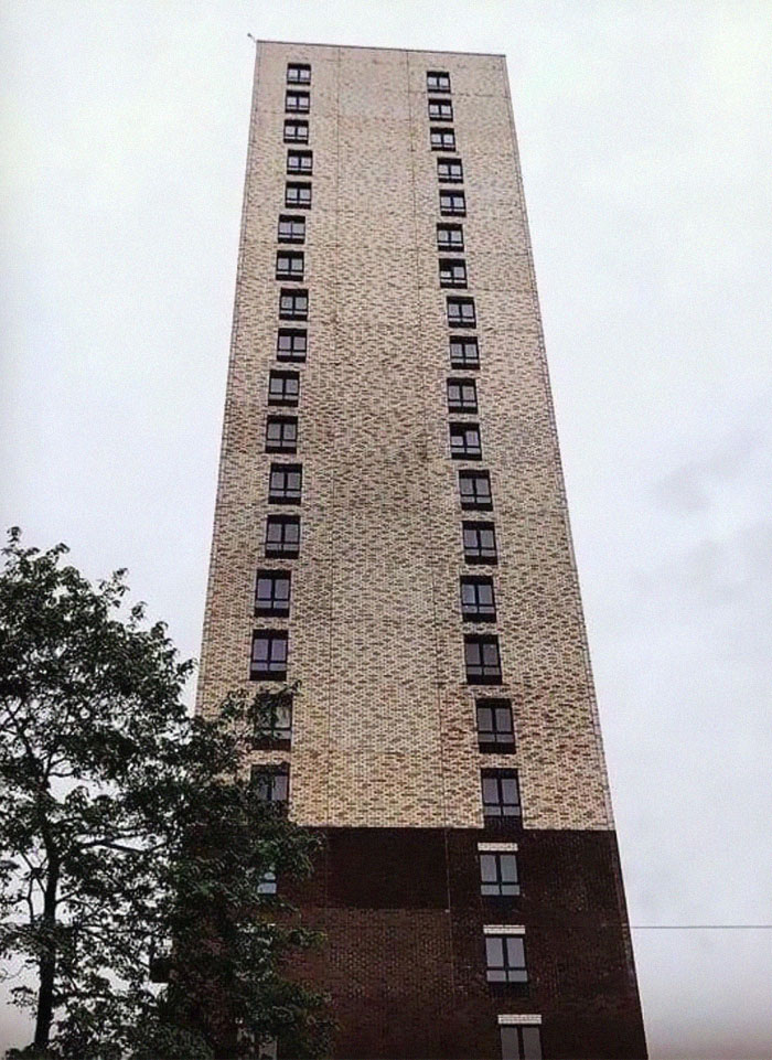
Image credits: architectureshaming
#8 I Might Like This If Those Were Slides

Image credits: architectureshaming
#9 A Friend Of Mine Cross-Posted This And It Made Me Think Of Y’all
Image credits: architectureshaming
“Quirky architecture comes from our innate desire to demonstrate our uniqueness. However, not everyone who has the means has an average taste for aesthetics. Yet, as long as it is for the people who inhabit or use their private space, I mean why not?” she told Bored Panda that as long as you’re not actively harming anyone else with how bad your designs are, you should be able to be as unique as you want. Even if it falls short of objective aesthetic standards.
#10 This Looks Like A Place A Villain Would Live
Image credits: architectureshaming
#11 Who Remembers Those Gerbil Enclosures That Look Like This?
Image credits: architectureshaming
#12 I’ll Meet Your Brutalism, And Raise You This
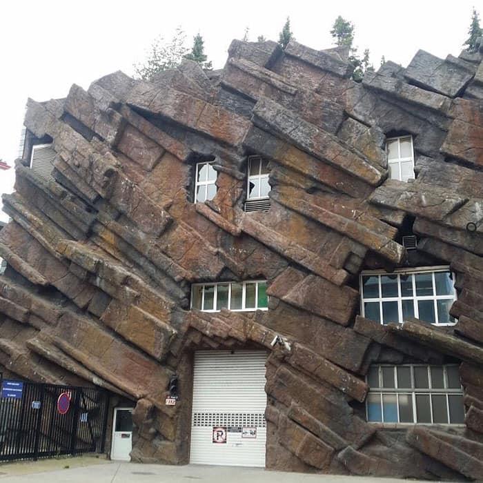
Image credits: architectureshaming
However, the expert acknowledged that others in the industry might not see things the way that she does. Others, she said, believe that private property must be in harmony with the surroundings.
“But, I think that we should not cross that thin line where architecture becomes reserved for only the wealthy and for those with ‘good taste’ (whoever decides that). I’m only talking about private property here, though. When it comes to public space, there should be a consensus between the public and the professional about the design,” she said that the rules for the private and public spheres are very different.
#13 Art Nouveau On Psychedelics

Image credits: architectureshaming
#14 Um… What Is This?

Image credits: architectureshaming
#15 “Sharkitecture”
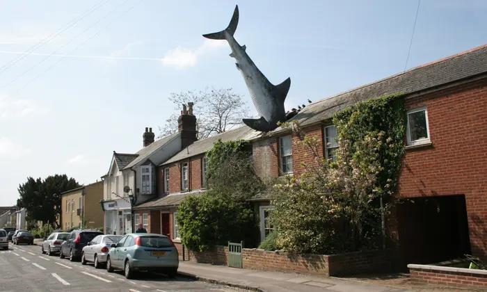
Image credits: architectureshaming
The urban planning expert also had some advice when it comes to design. “Firstly, even though I often advocate for unconventionally looking buildings, I do not encourage purposefully provocative architecture. The building should be designed with the intention to accommodate and protect society. It should create a sense of safety but not be boring,” she told Bored Panda that we ought to strike a balance between uniqueness and service, expression and community.
#16 A House I Used To Drive Past In A Little Iowa Town. All I Ever Heard From Locals Was That This Place Had A Terrible Leaking Problem When It Rained
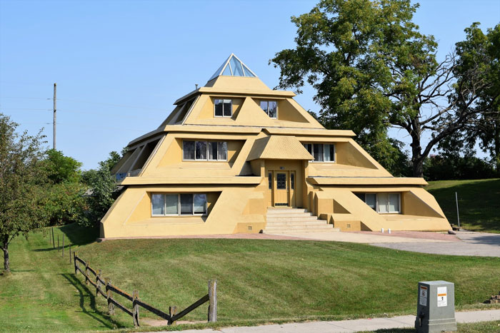
Image credits: architectureshaming
#17 Toilet-Shaped House (Named Haewoojae), Built By Sim Jae-Duck, The Chairman Of The Organizing Committee Of The Inaugural General Assembly Of The World Toilet Association
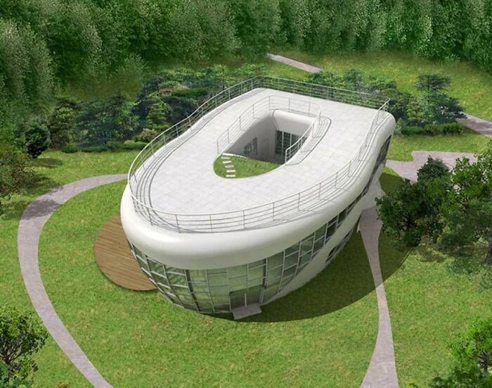
Image credits: architectureshaming
#18 I Wonder Who Thought This Would Be A Good Idea
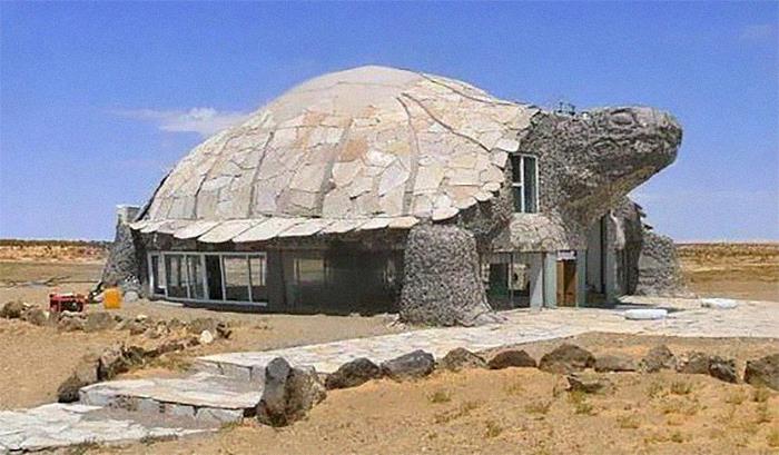
Image credits: architectureshaming
What’s more, the expert from Sweden pointed out that accessibility, inclusiveness, and empowerment should also be key features of any architectural project. “Also, I prefer somewhat complex but systemic designs. Minimalistic and box like floor plans are good in some cases where easy access is necessary (for example, hospitals) yet they can be completely mind-numbing while more complex floor plan designs are more mind-stimulating (for example, good for schools, in my opinion).”
#19 The “Snail House” In Bulgaria Actually Does Look Like A Snail
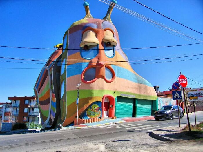
Image credits: architectureshaming
#20 You Too Can Have Your Own White Castle

Image credits: architectureshaming
#21 I Will Haunt Your Dreams! Residential Building In Belgium
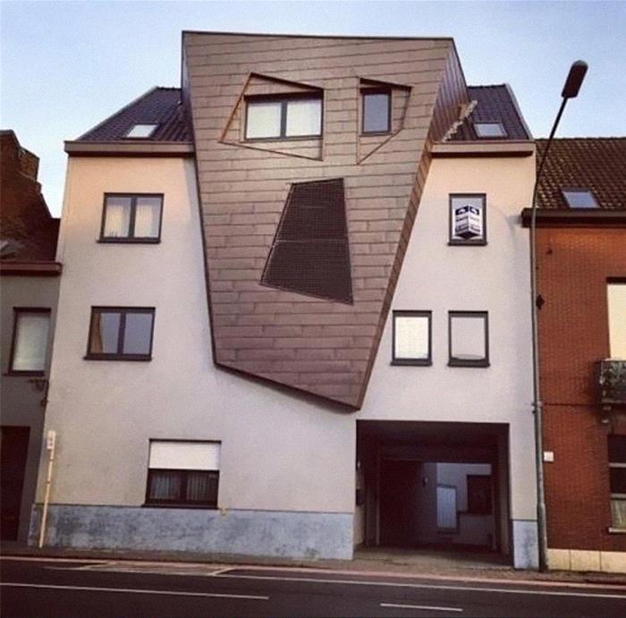
Image credits: architectureshaming
At the time of writing, the ‘That’s It, I’m Architecture Shaming’ community had 64.1k members. However, it’s growing so rapidly, that by the time you’re reading this, dear Pandas, that number could be much, much higher. Just in the last week alone, the group grew by over 7.3k members. And they’ve made upwards of a thousand posts in the last month.
#22 Interesting Concept

Image credits: architectureshaming
#23 I Think Syndrome From The Incredibles Lived Here
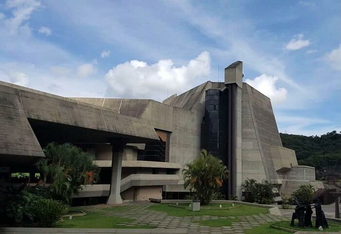
Image credits: architectureshaming
#24 Can We All Just Take A Moment And Acknowledge That Prince Produced Some Great Music, But He Lived In A Water Treatment Station
Image credits: architectureshaming
Because of this fast growth and the issues that came with it, the administrator of the ‘Architecture Shaming’ group, Oregon-based Matthew Brühn, addressed the community and the changes that took place in April. In short, the rules are much more structured now.
#25 Bangkok’s Elephant Building. The Tusks Are A Bowling Alley In My Imagination
Image credits: architectureshaming
#26 This Is Plane Awesome
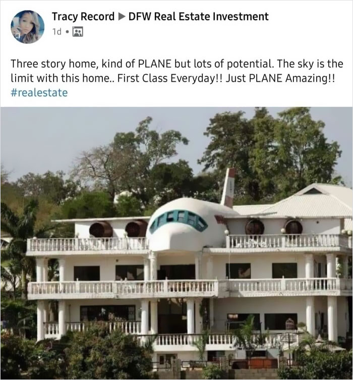
Image credits: architectureshaming
#27 They Drew The Line At A Fountain In The Kitchen

Image credits: architectureshaming
Matthew pointed out that the admins have been getting tired of the “massive influx of negativity” that came with more and more members joining the community. While the admin expressed his admiration for how wonderful many members are, he also noted that the group will start filtering out overly-aggressive posts.
#28 Why?
Image credits: architectureshaming
#29 Saw This On A Walk Today. A Table Lamp, In A Glass Box, Hanging From The Roof Of A Carport
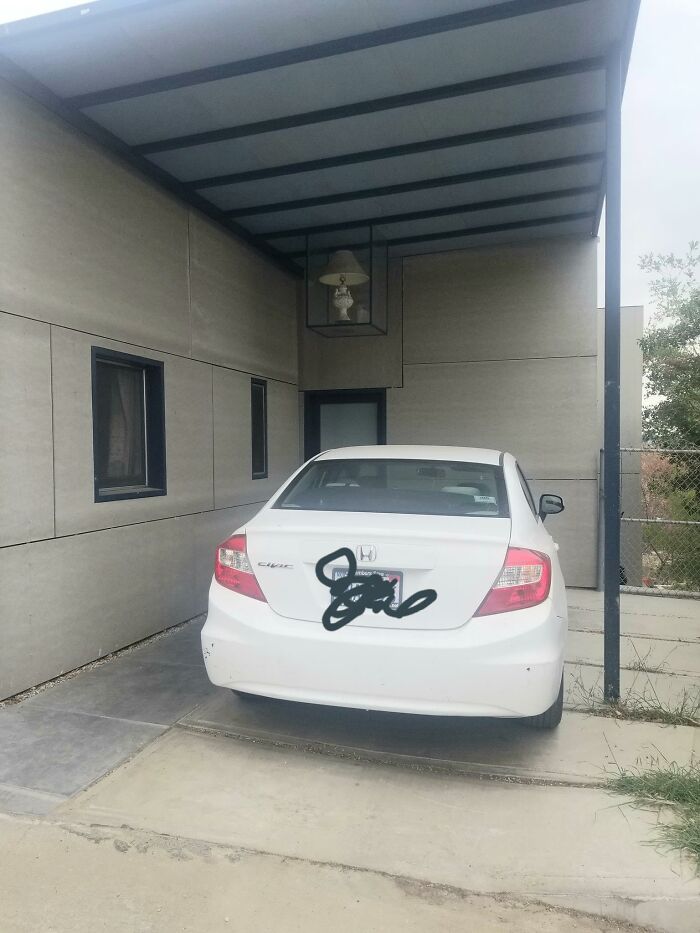
Image credits: architectureshaming
#30 Spotted This Gem In Tel Aviv
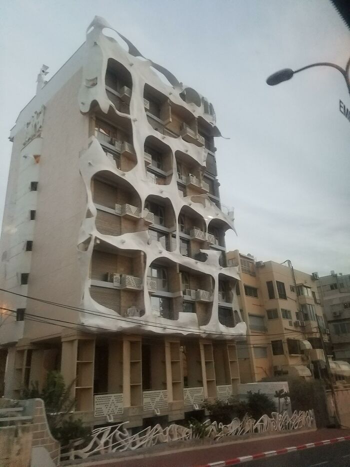
Image credits: architectureshaming
“Don’t take it personally; we’re just trying to create an atmosphere where we can all have fun and be kind. There’s now the equivalent of a small city of us all here now, so that will be more difficult,” Matthew pointed out. He added that mentions of politics and religion will be deleted while all potential new members have to answer some questions before they get in. Which, at the end of the day, leads to a friendlier and happier community that, we’re sure, plenty of you Pandas will want to join.
#31 Surrealist Neighborhood
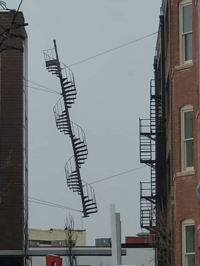
Image credits: architectureshaming
#32 This Building Has My City In A Uproar
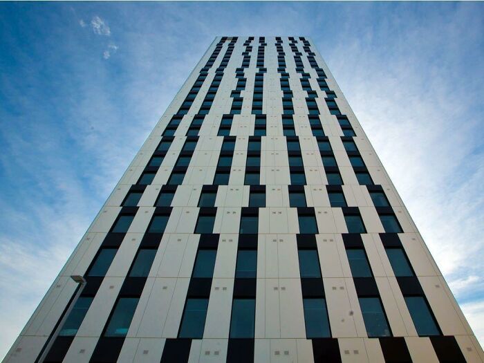
Image credits: architectureshaming
#33 Forbidden Waffle In Santiago

Image credits: architectureshaming
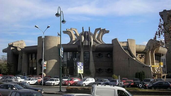
#34 The Glorious Flower Of Communist Brutalism That Is The Former Central Post Office In Skopje, Macedonia. Some People Want It Preserved
#35 This Place Is All Curb Appeal

Image credits: architectureshaming
#36 Please Don’t Take It Too Seriously, Just A Surprised House

Image credits: architectureshaming
#37 Kind Of Reminds Me Of A Church (Granted, A Strange One) But It’s Actually A House With A 6,000 Sq. Ft. Garage… And Its Own Car Wash
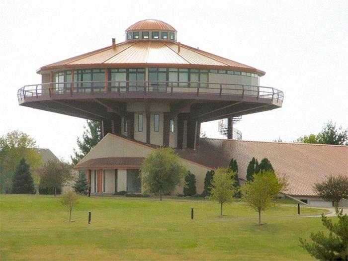
Image credits: architectureshaming
#38 I’ve Been Looking At Homes Trying To Get Ideas For When We Move In A Few Years And I Came Across A House That Was Perfect In Every Way Except One
What in the ever living fudge is this – one pass thru is ‘eh, but this one has three-at different levels plus the added detriment of the worlds worst architectural detailing around it. Please someone else tell me that you hate this as much as I do. I know it’s probably more interior design but it’s just so ugly.

Image credits: architectureshaming
#39 Just
Image credits: architectureshaming
#40 Car Dealership Trying For More Of A Classy Look!
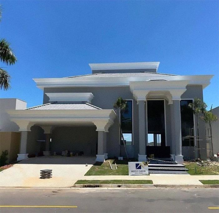
Image credits: architectureshaming